Online Trading Masterclass – ZIP (ASX) Market Structure in Motion
Online Trading Masterclass – ZIP (ASX) Market Structure in Motion
This online trading page is not designed to teach you step by step. It is designed to show you what a professionally prepared structural chart looks like once the work has already been done. What you are about to see is the finished product — built using disciplined structure, proportion, and layered analysis.
Behind this masterclass sits a complete framework. Financial review, market context, structural validation, and rule-based assessment have already been completed before a single line was drawn. For the purpose of this exercise, we are isolating structure only, so you can see what real market preparation looks like without the noise.
You are not expected to understand every line on these charts yet. The goal is to let you see the depth, the precision, and the control that separates structured analysis from guesswork.
Online Trading-Why ZIP Was Selected
ZIP represents a full market cycle. It expanded from its all-time low of $0.25 in September 2015 to its all-time high of $14.53 in February 2021. It then corrected, reset, and rebuilt from a secondary low of $0.435 in June 2022.
Volatility exposes structure. Strong trending phases expose wave behaviour. Deep corrections expose proportion and price memory. ZIP gives us everything required to demonstrate layered market analysis properly.
This masterclass shows you how that structure is revealed — layer by layer — across multiple charts. Each chart builds directly on the one before it. Nothing random. Nothing added for decoration.
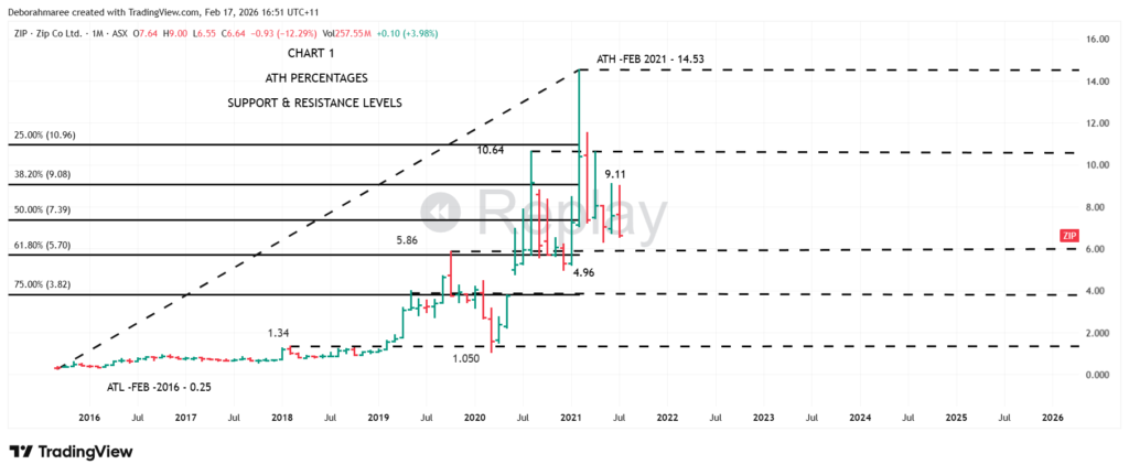
Online Trading-Chart 1 ZIP Monthly Chart
Below you will see the first layer of structure. This chart defines the major anchors — the all-time low, the all-time high, and the proportional compression levels that sit between them. These are not guesses. They are measured structural checkpoints.
We do not begin by chasing entries. We begin by defining the full range of the market cycle and identifying the percentage relationships that govern behaviour inside that range. Without this layer, every lower timeframe becomes reactive and unstable.
Chart 1 establishes context. Chart 2 will build upon that context with historical support and resistance memory. Chart 3 will introduce wave structure. Chart 4 will refine the move using internal structure on the weekly timeframe.
Under each chart, you will receive commentary explaining what was added and why it matters. You will not be shown how to construct it step by step here — that process is reserved for the full structured framework.
The purpose of this masterclass is simple: to let you see what finished, disciplined market structure looks like before execution is ever considered.
Online Trading-Chart 1-Monthly ZIP Chart
Online Trading-Chart 2-Monthly ZIP Chart
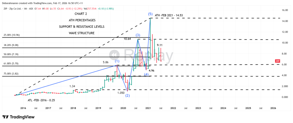
Chart 2 takes what you saw in Chart 1 and deepens it.
In Chart 1, we identified the structural spine of ZIP — the all-time high, the proportional retracement zones, and the broader recovery framework. That gave us context. Now we build on it.
This chart introduces support and resistance alongside the higher-timeframe percentages. You can now see how raw proportion begins aligning with real behaviour. Markets do not respond to one line. They respond to clusters. When historical support, prior resistance, and Fibonacci proportion begin stacking in the same region, structure becomes visible.
Notice how the $14.53 all-time high remains the dominant structural ceiling. Beneath it, the $10.64 region and the $5.86 region begin forming repetitive reaction zones. The $3.98 area, which sits close to the deeper retracement level, becomes particularly important during long-term repair phases. And the $1.34 region represents the final structural memory before expansion began.
This is where online trading starts to become logical rather than emotional.
We are not adding indicators for noise. We are identifying behavioural checkpoints. Each level exists because the market has already proven it matters. Structure is not drawn randomly. It is earned through repetition and reaction.
You will also notice that these horizontal levels now overlap with the percentage retracements from the previous chart. That overlap is called confluence. Confluence is where probability strengthens because multiple structural tools are agreeing in the same price zone. Professionals do not trade single lines. They trade areas of agreement.
Behind the scenes, full fundamental and balance sheet analysis has already been completed. That layer is not shown here. For the purpose of this masterclass, we are isolating structure only. Financial analysis and risk calibration are taught step-by-step inside the She Trades Shares structured course. Here, we are focused purely on how clean structure is built.
Chart 2 is not about prediction. It is about framing.
You are beginning to see how a blank chart transforms into a mapped framework. And this is still only the foundation. The next chart builds further — adding behavioural structure and wave progression to show how expansion and correction phases actually unfold inside that framework.
- Each chart stacks on top of the previous one.
- By the time you reach the final chart, what once looked confusing will begin to look controlled.
- That is the difference between guessing and structured online trading.
If this level of structure feels different from what you normally see online, that is the point. The full step-by-step framework — including how to build this from scratch, validate it correctly, protect risk, and apply it consistently — is taught inside the complete She Trades Shares E-Book.
Chart 3 will now take this structural foundation and layer in wave behaviour so you can see how movement unfolds inside mapped structure.That is where it starts becoming powerful.
Online Trading-Chart 3-Monthly ZIP Chart
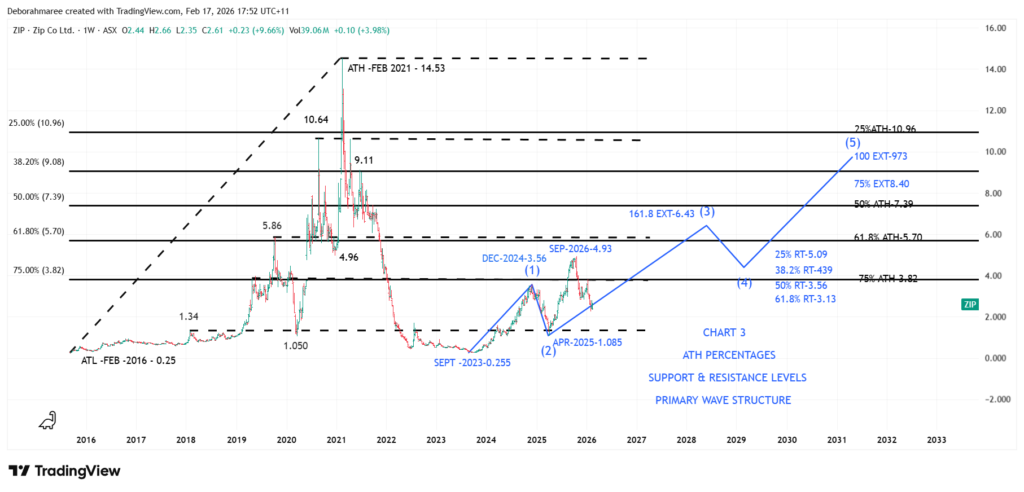
Chart 3 – Monthly ZIP Chart – Structure, Wave Behaviour & Confluence
Chart 3 builds directly on Chart 2.The structural foundation remains the same. The all-time high percentages remain in black. The major support and resistance levels remain in black. Nothing has been removed.
What has been added is behavioural structure — and that is marked in blue.The blue wave structure represents the current recovery sequence developing from the September 2023 low. This is not hindsight plotting. It is structural mapping based on observable expansion and correction behaviour.
You will notice that the projected extensions and retracements are also drawn in blue. This is deliberate. Black represents historical structure. Blue represents active behavioural progression.When black and blue begin to align, that is where confluence emerges.
For example, the projected 161.8% extension of the current recovery sequence sits near $6.43. That level does not exist in isolation. It interacts with prior structural zones already defined in Chart 2.
This is not a prediction.It is the minimum structural expectation when a recovery sequence begins expanding from a confirmed wave two low. The 161.8% extension is textbook proportional behaviour — but until structure confirms, it remains a mapped possibility, not a forecast.
If price were to complete a 161.8% extension, textbook wave behaviour would then expect a corrective pullback — commonly into the 38.2% region of that expansion. Again, this is structural proportion. Not certainty. Not guarantee. Proportion.Only after that corrective behaviour completes would a 100% extension target near $9.73 become structurally visible as a higher wave objective.
Notice what is happening visually on the chart.
- Black levels represent historical proportion and memory.
- Blue levels represent current behavioural expansion and measured projections.
- Where black and blue overlap, structural probability strengthens.
This is how layered chart construction creates clarity. We are not guessing where price will go. We are measuring where structure permits movement to travel if behaviour remains proportionally consistent.At this monthly stage, this is all the information available.There is no anticipation. No bias. No emotional prediction.The monthly chart provides structural possibility. It does not provide execution detail.
To understand whether this mapped projection is realistic, overstretched, or internally supported, we would then break down to the weekly timeframe to examine internal wave behaviour. But that is the next layer.Right now, you are seeing how professional online trading analysis blends historical proportion (black) with active behavioural mapping (blue) to identify confluence zones before emotion ever enters the decision process.
This structured, layered methodology — including how to measure extensions correctly, validate retracements, manage invalidation points, and protect risk — is taught step-by-step inside the She Trades Shares E-Book. What you are observing here is the finished product of that framework applied to a live ASX market structure.
Online Trading-Chart 4 – Weekly ZIP Chart
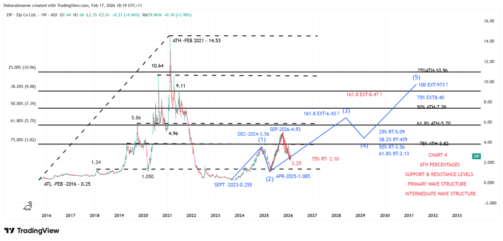
Chart 4 – Weekly ZIP Chart – Internal Structure Check (Hierarchy Test)
This chart is where the analysis becomes “adult.” The monthly framework is still the boss, but the weekly chart is where we test whether the monthly projection is structurally valid inside real internal movement. This is not prediction. This is conflict detection and hierarchy checking.
You will notice 3 layers working at once. The black levels remain the same all-time high percentages and the same support and resistance framework. The blue mapping remains the primary wave projection we built from the higher timeframe. What is new is the red internal wave behaviour on the weekly chart, which is the “inside story” that either supports the monthly idea or forces a recalculation.
What you are looking at on Chart 4
- Black: All-time high percentage levels and the major support and resistance zones.
- Blue: The primary wave structure projection from the monthly framework.
- Red: The intermediate internal wave structure on the weekly chart used to test proportional integrity.
The weekly internal structure gives us measurable information that the monthly chart cannot give on its own. If the internal measurements stay “inside” the broader monthly pathway, the monthly projection remains structurally stable. If the internal measurements project beyond the monthly pathway, the hierarchy is telling us something important: the larger count may need to be extended or re-labelled to remain valid.
Here is the key structural discovery on this chart
- The retracement from the intermediate internal wave 1 into wave 2 measures approximately 75%, near $2.10.
- A 75% retracement is deep, but it can still be structurally acceptable when behaviour remains proportional.
- The minimum 161.8% extension of that internal sequence measures near $8.47.
Now the critical thinking moment. On the monthly chart, the earlier minimum 161.8% extension projection was around $6.43 in blue. On the weekly chart, the internal 161.8% extension in red is projecting around $8.47. That creates a mismatch, because the internal pathway is now larger than the higher timeframe pathway it is supposed to sit inside.
This is exactly why the question marks exist. They do not mean “it will go there.” They mean “if internal structure is demanding $8.47 to remain proportionally valid, then the earlier monthly projection to $6.43 is likely incomplete, and the primary wave count may need to be extended or re-evaluated.” That is how a professional chart stays honest instead of forcing a narrative to fit.
What Chart 4 proves (without giving away execution)
- Monthly structure is the framework, but weekly structure is the verification layer.
- Confluence is not just “levels lining up,” it is also “timeframes agreeing.”
- When internal projections exceed higher timeframe projections, hierarchy must be reassessed before any execution logic is even considered.
Important note
Nothing on this page is a trade call. This is a structural demonstration only. Execution, entries, invalidation rules, and risk calibration are taught step by step inside the She Trades Shares structured course, not on this masterclass page.
Bridge to the full learning (this is where the real course starts)
If you are reading this and thinking “I want to understand how to build charts like this,” that is the point of the masterclass. You are not meant to understand every label yet. You are meant to see what clean structure looks like once the full process has been applied properly.
Inside the Trading For Beginners E-Book (the complete step-by-step structured course), you do not just learn ZIP. You learn the full top-down methodology from start to finish, so you can build structure across any stock without guessing, without chasing hype, and without relying on random indicators as a shortcut.
What you learn inside the E-Book and structured course
- Top-down analysis: Monthly first, then weekly, then daily for timing only.
- How to build a chart properly: Structure, levels, and clean decision zones.
- How to use Fibonacci proportion as a structure tool, not a prediction tool.
- How to understand wave behaviour and why internal structure can override a “nice looking” projection.
- Risk and behaviour reality: How professionals protect capital before they try to grow it.
- Trading psychology: How to stop reacting emotionally and start thinking in process.
- The core technical toolkit: Moving averages, RSI, MACD, and volume (used as confirmation, not signals).
- A complete structured workflow with 13 sections that removes guesswork and creates consistency.
This masterclass will continue to build chart by chart, layer by layer, so you can see what the finished product looks like in real market conditions. The full “how to do it” framework, the rules, and the execution layer remain inside the paid structured course.
Get the Trading For Beginners E-BookOnline Trading-Chart 5 – Weekly ZIP Chart
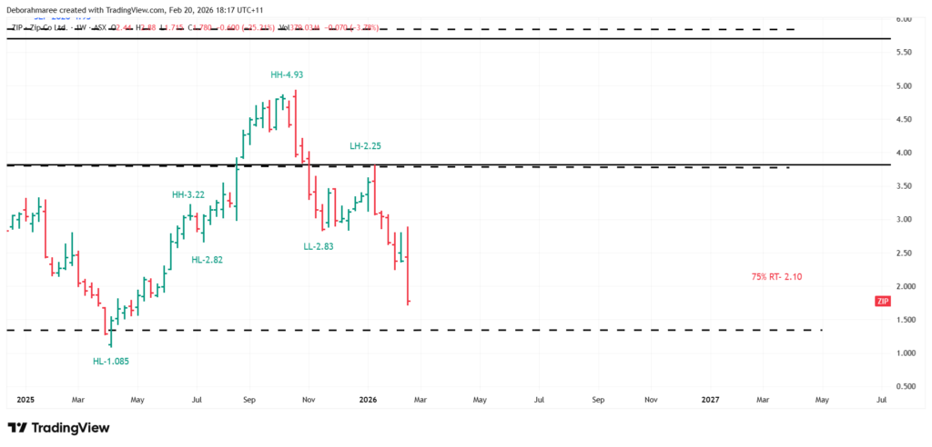
Chart 5 – Weekly ZIP Chart
Up to this point, you have seen how the monthly framework defines the range and the key proportion levels, and how the weekly chart is used as the verification layer to test whether the internal structure supports the higher timeframe map.The next step is to watch that structure move in real time. This is where the analysis shifts from static levels to live behaviour. The purpose of Chart 5 is not to teach execution. It is to show how a professionally prepared structure is tracked as it evolves, bar by bar, without prediction and without emotion.
Chart 5 focuses on weekly market structure and the sequence of Higher Highs and Higher Lows that built the prior trend, followed by the first confirmed structural breaks that signal a change in condition. This is how traders stay aligned with what price is actually doing, rather than what they hope it will do.
Online Trading-Chart 5 commentary.
This weekly chart begins from the established structural low at $1.085. From that point, price builds a rising sequence that can be tracked as a progression of Higher Highs and Higher Lows. The key purpose of this labelling is not to “name” bars. It is to confirm whether the market is still expanding upward in an orderly way, or whether that behaviour has started to fail.
In this sequence, it is normal to see pauses and compression bars such as inside bars and outside bars. Those bars do not automatically create a new swing point on their own. They often represent consolidation or range expansion inside the same structural leg. The correct approach is to treat them as a “wait” condition until the next structural decision becomes clear.
As price continues upward, the trend remains valid while the sequence of Higher Highs and Higher Lows continues to hold. That is the behavioural definition of an uptrend on the weekly chart. You are not guessing. You are measuring.
The critical change happens after the peak around $4.93. Once a Lower Low forms near $2.83, the prior rising sequence is no longer intact. That is the first clear warning that the market has shifted from expansion into a different condition. After that, the rally into the Lower High near $2.25 confirms that the recovery attempt has failed to restore the previous trend behaviour.
At this point, the chart is no longer in “trend continuation” mode. It is in “trend change and reset” mode. The correct response is not to force an entry. The correct response is to wait for price to build the next measurable structure that proves a new sequence is forming.
You will also notice that this structural change is occurring inside a major confluence zone. That zone is defined by historical support and resistance memory and the deeper percentage retracement levels from the all-time high. When structure and proportion overlap, the market often reacts more aggressively, because more than 1 framework is participating in the same region. This is not a prediction. It is an explanation of why this area matters structurally.
From here, the masterclass continues to track behaviour as it unfolds. The goal is to show you what disciplined structure-tracking looks like in real market conditions, without turning the process into a trade call. Execution rules, invalidation rules, and risk calibration belong inside the complete She Trades Shares structured course.
Get the Trading For Beginners E-BookResources 🔗
If you’re looking for tools, walkthroughs, masterclasses, cheat sheets, and structured guidance, visit the She Trades Shares Resource Hub. This is your central access point to everything we’ve built — from paper trading support to full step-by-step share trading education.
Trading for Beginners Guide – The Ultimate Resource Hub