Online Trading – Masterclass Series 3 – QBE (ASX) Technical Analysis & Market Structure

Online Trading – Chart Structure Step-by-Step Analysis
This online trading masterclass shows how professional chart structure is built using the ASX stock QBE as a real market example. What you are about to see is the finished result of a disciplined process built on structure, proportion, and market behaviour. This is not a trading signal page and it is not a prediction page. It is a real demonstration of how serious chart preparation looks before execution is ever considered.
Most people are shown charts the wrong way. They are taught entries before structure, indicators before context, and opinions before process. That is why so many beginners feel confused. This page is designed to reverse that. Instead of guessing, you will see how a blank chart becomes a structured decision framework layer by layer.
You do not need to understand every line yet. The purpose of this masterclass is to let you see the difference between random charting and professional preparation. Once you understand structure, the same framework can be applied across shares, Exchange Traded Funds (ETFs), futures, indices, and crypto markets. The instrument may change. Structure does not.
Understanding The Type Of ASX Stock You Are Looking At
QBE (ASX) is considered a defensive insurance and dividend-focused ASX financial stock. Unlike high-growth momentum companies, defensive financial stocks often produce slower but more stable market behaviour due to recurring cash flow, insurance premiums, and established business operations.This creates a very different chart structure compared to high-volatility growth stocks such as ZIP or cyclical resource stocks such as PLS.
Understanding the type of stock being analysed is an important part of professional market preparation because different sectors often produce different volatility, trend behaviour, dividend characteristics, and risk profiles.ASX insurance stocks are often influenced by claims cycles, premium growth, catastrophe risk, interest rates, and broader financial market conditions. This is why both technical analysis and fundamental analysis matter when analysing companies like QBE.
Online Trading – Why QBE Was Selected
QBE was selected because it represents a very different type of ASX market structure compared to high-growth momentum stocks. As a large international insurance and financial services company, QBE allows traders to study how defensive ASX shares behave during long-term market cycles.Unlike speculative resource stocks or aggressive growth companies, QBE often produces cleaner structural behaviour, slower trend development, stronger institutional participation, and more stable support and resistance zones. This makes it an ideal educational example for learning how professional chart structure develops over time.
QBE also demonstrates how defensive dividend-focused ASX stocks can still experience major trend phases, corrections, recovery structures, and breakout behaviour while maintaining broader long-term stability. This helps traders understand that different sectors produce different personalities, volatility profiles, and structural rhythms. Each chart in this masterclass builds directly on the one before it. Nothing random. Nothing decorative. Every level must earn its place. If you have ever looked at a chart and thought, I do not know where to begin, this page is designed to change that. You are about to see how a blank chart becomes a mapped decision framework using structure, proportional measurement, behavioural confirmation, and market context. Once you begin understanding the process properly, charts stop feeling chaotic. They start becoming readable.Start with the first chart below. Then follow each layer as new information is added and the market picture becomes clearer.
Online Trading-Monthly Chart 1-QBE
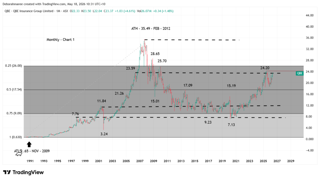
Online Trading – Chart 1 – QBE Monthly Chart Structure
Take a moment to study this first chart carefully.
This is the monthly QBE chart and it shows the first structural layer of the analysis. On this chart we have marked the all-time low at $0.65 in November 2009 and the all-time high at $35.49 in February 2012. Between those 2 extremes, the major proportional retracement levels at 25%, 50%, 75%, and the full range low have been mapped. These levels create the higher-timeframe framework of the full market cycle and define the range we are analysing.
We have also marked the major support and resistance levels already proven by price. Key structural zones can be seen around $7.13, $7.76, $9.23, $11.84, $15.01, $15.19, $17.09, $21.26, $23.59, $24.20, $25.70, and $28.65. These are areas where the market has previously reacted, stalled, accelerated, or reversed. That makes them important reference points for the next layers of analysis.
One of the most important areas on this chart is the current price region near the old $23.59 structural high. This level acted as a major historical resistance area before QBE eventually pushed into its 2012 all-time high. Price has now returned to this same region, with the recent structure pressing back toward the $24.20 area. That means QBE is now testing whether an old resistance zone can begin behaving as a new support region.
At this stage, the purpose is not to predict the next move and it is not to teach the full chart-building process. The purpose of this masterclass is to show you what a professionally prepared chart looks like once the structural work has already been completed. We are showing you the finished analysis, not the full method behind it.
Chart 1 matters because everything added later must sit inside this framework. If the higher-timeframe structure is wrong, every lower layer becomes weaker. This chart is the structural spine of the entire QBE market cycle.
The next chart builds directly on this foundation and shows how additional layers begin aligning with the framework you see here. If you want to learn how this process is actually done step by step, that is what the She Trades Shares Trading For Beginners E-Book is designed to teach.
Want To See What’s Inside The Trading For Beginners Course Before You Buy?
See What You Get Inside The E-Book For $49Online Trading-Monthly Chart 2-QBE
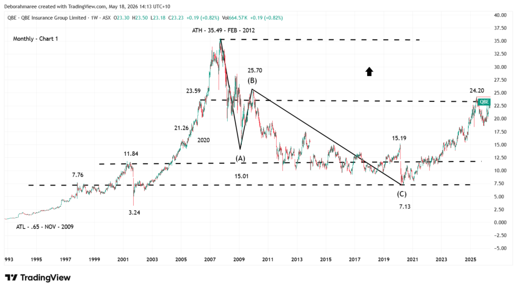
Online Trading – Chart 2 – Monthly QBE Support, Resistance and Corrective Wave Structure
Chart 2 builds directly on the structural framework introduced in Chart 1.
In the previous chart, we identified the all-time low at $0.65, the all-time high at $35.49, the major retracement zones, and the key support and resistance levels already proven by historical price behaviour. That gave us the higher-timeframe framework. This chart now adds behavioural structure and corrective wave progression.
The black wave structure mapped on this chart represents a possible long-term ABC corrective sequence developing from the 2012 all-time high. At this stage, this is not being treated as a confirmed completed Elliott Wave count. It is a structural interpretation based on proportional behaviour, overlapping movement, and the way the market has responded around key historical levels.
The first major decline from the all-time high at $35.49 into the $15.01 region is labelled as Wave A. From there, QBE produced a large corrective recovery rally into the $28.65 region, which is being interpreted as a possible Wave B recovery phase. The final decline from $28.65 into the major low at $7.13 is then mapped as the potential completion of Wave C.
One of the reasons this interpretation is important is because the overall decline from $35.49 to $7.13 does not currently behave as a clean impulsive five-wave bearish structure. The market shows significant overlapping behaviour, extended sideways movement, and corrective characteristics throughout the decline. Structurally, the broader ABC interpretation currently appears more proportional and internally consistent than a completed bearish five-wave collapse.
This does not mean the correction is guaranteed to be complete. It means the behaviour from the $7.13 low onward now becomes extremely important.
From the $7.13 low, QBE has produced a substantial recovery rally back into the $24.20 region. This places current price approximately within the deeper retracement region of the entire decline from the all-time high. Structurally, that creates an important decision zone.
The $24.20 level now becomes the immediate structural ceiling being tested by price. Above that, the next major historical resistance cluster sits around $25.70, followed by the larger structural pivot near $28.65. These zones matter because they represent prior areas where the market previously failed, reversed, or accelerated lower. If price can eventually accept above those regions, the larger bullish rebuilding scenario becomes structurally stronger. If rejection begins occurring at those levels, the possibility of the current rally behaving as a larger corrective recovery still remains open.
This is why professional chart analysis is never about certainty. It is about identifying the most structurally logical possibilities and allowing future price behaviour to confirm which pathway the market is actually choosing.
At this monthly stage, the chart provides structural possibility only. It does not provide execution detail. The next layer of analysis requires dropping into the weekly timeframe to examine the internal behaviour developing from the $7.13 low. That is where we begin testing whether the current recovery is behaving more like the early stages of a new impulsive advance, or whether it still carries corrective characteristics internally.
Chart 2 is therefore not about prediction. It is about structural interpretation and behavioural mapping. We are identifying the important historical zones, the possible corrective sequence, and the areas where future market behaviour becomes critical.
The next chart will now move into the weekly timeframe to begin examining the internal structure developing inside this recovery phase.
Want To See How Professional Traders Build Structure Step By Step?
Start Learning Trading The Right WayOnline Trading-Weekly Chart 3-QBE
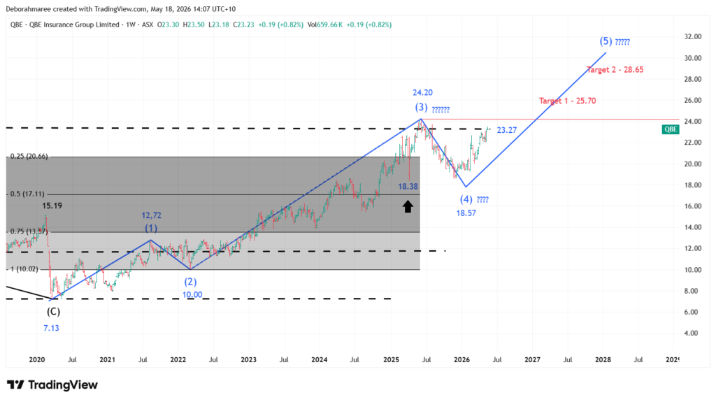
Online Trading – Weekly Chart 3 – QBE Internal Wave Structure
This chart now shifts from the higher-timeframe monthly structure into the internal weekly structure developing inside the broader QBE framework.
The blue wave count has been used intentionally to separate the weekly structure from the larger primary structure shown previously in black on the monthly charts. This allows us to study the internal behaviour of price movement without confusing it with the broader long-term market cycle.
At this stage, the weekly structure currently shows a possible developing impulsive sequence beginning from the major $7.13 low. The current working structure identifies a potential Wave 1 at $12.72, a possible Wave 2 retracement into $10.00, a strong advance into the potential Wave 3 region at $24.20, and a developing corrective area currently being monitored near the $18.38 to $18.57 region.
One of the most important areas on this chart is the black arrow marked at $18.38. This level represents the final meaningful swing low before the market pushed higher into the current $24.20 resistance zone. The reason this matters is because the market has not yet broken below that level. As a result, we cannot currently confirm that a completed Wave 4 correction has fully developed.
At this stage, there are still 2 realistic structural possibilities being monitored.
The first possibility is that the move into $24.20 completed a developing Wave 3 structure and the market is currently building a larger Wave 4 correction before potentially attempting another advance higher.
The second possibility is that the move into $24.20 may still be part of an extending Wave 3 structure that has not yet fully completed. This possibility remains valid because the market has not yet confirmed a lower structural sequence beneath the $18.38 region.
Because of this uncertainty, the current wave labels remain intentionally conservative. The structure is being monitored rather than forced into a fixed prediction. This is important because professional chart analysis must evolve with price behaviour rather than attempting to predict future movement with certainty.
The current resistance region near $24.20 remains one of the key structural decision zones on the chart. If price can eventually establish acceptance above this level, the next major confluence resistance zones begin appearing near $25.70 and then again near $28.65. These zones are not random projections. They are derived from previous higher-timeframe support and resistance behaviour already identified on the monthly charts.
At the same time, the $18.38 region remains structurally important because it currently acts as the final significant swing low inside the developing weekly structure. Until the market clearly breaks either above resistance or below support, both continuation and corrective scenarios remain possible.
This chart demonstrates one of the most important concepts in structural analysis. Markets do not always reveal their final wave structure immediately. Sometimes the correct approach is not prediction. Sometimes the correct approach is disciplined observation while the market continues building evidence.
The next stage of analysis would involve moving down into lower-timeframe structure to study whether internal behaviour begins supporting continuation or deeper correction. However, at this stage, the weekly chart already provides a strong structural framework for monitoring the current QBE market cycle.
Want To See How Professional Traders Build Structure Like This? Stop Piecing Trading Together Alone.
Start Learning Trading The Right WayUpdated 19/05/26 – Fundamental Overview – QBE Insurance Group
Alongside the technical structure already analysed in the previous charts, QBE also presents as a fundamentally stable business operating inside the global insurance sector.
At the time of this analysis, QBE is producing strong earnings, maintaining healthy profit margins, and continuing to generate solid cash flow. The company also operates with relatively low weekly volatility compared to many higher-risk ASX growth stocks.
Unlike speculative momentum stocks, QBE currently behaves more like a mature institutional-quality business focused on stability, operational performance, and long-term capital management.
Valuation, Earnings and Business Quality
One of the most interesting aspects of QBE’s current position is the disconnect between its valuation and its operational performance.
QBE is currently trading on a relatively conservative PE ratio compared to several major insurance peers, despite producing strong earnings growth and maintaining a solid balance sheet profile. The company also continues paying dividends while generating healthy cash flow support behind its earnings.
At the same time, future growth expectations remain more moderate than many high-growth sectors. This means the market currently views QBE more as a defensive value-style company rather than an aggressive expansion stock.
Want To Explore QBE’s Financials In More Detail?
View QBE On Simply Wall StFundamental Conclusion
From a fundamental perspective, QBE currently appears stronger as a stable long-term quality business than as a high-risk speculative growth stock.
The combination of solid earnings, improving operational performance, conservative valuation metrics, and relatively stable price behaviour helps support the broader technical structure already identified throughout this masterclass.
However, future growth expectations remain an important factor to monitor. Like all insurance businesses, QBE still remains exposed to changing market conditions, claims cycles, and broader economic risks. This is why both technical structure and fundamental behaviour must continue being monitored together rather than relying on a single form of analysis alone.
Resources 🔗
This is Series 4 of a 4 part series Online Masterclass including ZIP(ASX), PLS(ASX), QBE(ASX) – TLS(ASX) – “Coming Soon”
Once you have finished analizing this post you can then move on to the next Series featuring PLS (ASX), ZIP(ASX), TLS(ASX) Start here first, then click below to view the other masterclasses. You can then compare how the same structure applies to a different market. Once you’ve started learning the framework, you can explore additional tools, walkthroughs, and resources inside the She Trades Shares Hub
Trading for Beginners Guide – The Ultimate Resource Hub
Masterclass Series
View Online Masterclass ZIP – Series 1 Here
View Online Masterclass PLS – Series 2 Here
View Online Masterclass TLS – Series 4 Here

Understand the market.
Trade QBE with confidence.