Online Trading Masterclass Series 2 – PLS (ASX) Technical Analysis & Market Structure

Online Trading – Monthly PLS Structured Step-by-Step Analysis
This online trading masterclass demonstrates how professional chart structure is built step by step using the ASX stock PLS as a real market example. Before we begin, it is important to understand what you are actually looking at on this page. This is not a trading signal page. It is not a prediction page. It is not random lines drawn after the fact. What you are about to see is the finished result of a disciplined chart preparation process built on structure, proportion, and market behaviour.
The purpose of this masterclass is simple: to show you what serious market preparation looks like once the full framework has been applied correctly. Most beginners never see charts prepared this way. They are usually shown indicators first, hype first, or entry signals first. That is why so many people feel confused. They are taught the wrong layer first. Structured learning changes that.
Understanding The Type Of ASX Stock You Are Looking At
PLS (ASX) is considered a cyclical ASX lithium and resources growth stock. Unlike defensive dividend-focused companies, cyclical resource stocks are heavily influenced by commodity prices, global supply and demand, production expectations, and market sentiment toward the resources sector.
This creates a very different chart structure compared to defensive financial stocks such as QBE or infrastructure and telecommunications companies such as TLS.
Understanding the type of stock being analysed is an important part of professional market preparation because different sectors often produce different volatility, trend behaviour, cycle behaviour, and risk profiles.
ASX lithium stocks can experience powerful momentum phases during strong commodity cycles, but they can also produce significant volatility during periods of economic uncertainty or falling lithium prices. This is why structure, risk management, and market context become extremely important when analysing resource companies like PLS.
Online Trading – Why PLS Was Selected
PLS represents a complete structural case study. It expanded from its all-time low of $0.007 in October 2013 to its all-time high of $6.14 in April 2026. Along the way it produced deep corrections, breakout phases, powerful momentum runs, and major retests of prior structure. Strong trends expose behaviour. Corrections expose proportion.Retests expose price memory. Volatility exposes whether levels truly matter. PLS gives us all of that in one chart. This is why it is an ideal educational example. It allows you to study how a market builds over time instead of reacting to random headlines.
Each chart in this masterclass builds directly on the one before it. Nothing random. Nothing decorative. Every level must earn its place. If you have ever looked at a chart and thought, I do not know where to begin, this page is designed to change that.You are about to see how a blank chart becomes a mapped decision framework. That is the real difference between guessing and preparation. It is also why structure-first learning matters so much for beginners. Once you see the process clearly, charts stop feeling chaotic. They start becoming readable.
Inside the She Trades Shares Trading For Beginners E-Book, the full step-by-step process is explained in plain English. You learn how to build this type of chart yourself from opening your charting platform, to identifying structure, measuring proportion, validating behaviour, and protecting risk before money is ever placed at risk. In other words, this masterclass shows you the finished analysis. The E-Book teaches you how to build it. That difference matters.
Behind the charts presented here sits a complete analytical framework. Structural review, market context, proportional measurement, support and resistance mapping, behavioural testing, and rule-based chart construction are completed before a single decision is considered. For the purpose of this page, we are isolating the structural layer so you can see what real market preparation looks like without unnecessary noise. You are not expected to understand every line yet. The goal is to let you see the depth, precision, and discipline that separates structured market analysis from guessing.
Once you understand how to construct market structure properly, the same framework can be applied to shares, Exchange Traded Funds (ETFs), indices, futures, and crypto. The instrument may change. Structure does not. In this masterclass we are using the ASX stock PLS as the working example because it provides a powerful market cycle to study. It contains expansion, correction, recovery, resistance testing, and live structural behaviour. The charts below demonstrate what that process looks like when it is applied to a real ASX market.
Online Trading – Chart 1 PLS Monthly Chart
Below you will see the first layer of structure. This chart defines the major anchors of the entire market cycle. It includes the all-time low at $0.007. It includes the all-time high at $6.14. It includes the key percentage levels inside that full range.
The chart also includes the major historical support and resistance zones already proven by price. These are not guesses. They are measured structural checkpoints. The 25% retracement level sits near $4.61. The 50% retracement level sits near $3.07. The 75% retracement level sits near $1.54.
You will also notice major behavioural zones near $1.07, $3.89, and $5.66. These levels matter because price has already reacted there. This is where professional chart work begins. We do not begin by chasing entries. We begin by defining the full range of the market and identifying the levels that control behaviour inside that range.
Without this layer, lower timeframe analysis becomes reactive and unstable. Chart 1 establishes context. Chart 2 will build on this foundation by highlighting where historical support, resistance, and percentage levels begin clustering together. That is where confluence starts to emerge. Structure builds in layers.
Chart 3 will explore behavioural structure and expansion logic. Chart 4 will test the move internally using the weekly timeframe. Take a moment to study this first chart carefully. What looks simple on the surface is actually the structural spine of the entire PLS market cycle. That is why this first chart matters.
Online Trading – Chart 1
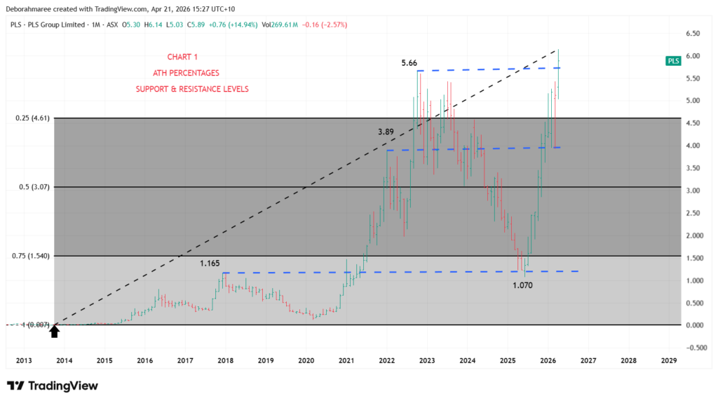
At this stage, the purpose is not to predict the next move and it is not to teach the full chart-building process. The purpose of this masterclass is to show you what a professionally prepared chart looks like once the structural work has already been completed. We are showing you the finished analysis, not the full method behind it.Chart 1 matters because everything added later must sit inside this framework.
If the higher-timeframe structure is wrong, every lower layer becomes weaker. This chart is the structural spine of the entire PLS market cycle.The next chart builds directly on this foundation and shows how additional layers begin aligning with the framework you see here. If you want to learn how this process is actually done step by step, that is what the She Trades Shares Trading For Beginners E-Book is designed to teach. Are you are ready to start building charts like this?
Want To See What’s In Side The Trading For Beginners Course Before You Buy?
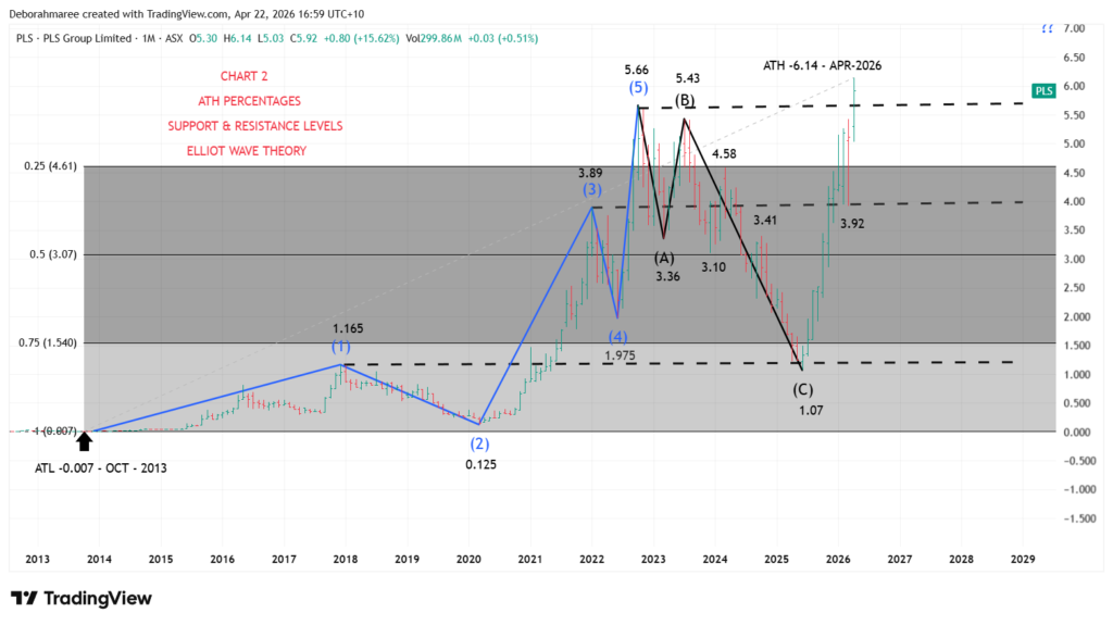
See What You Get Inside The E-Book For $49Online Trading – Chart 2 PLS – Monthly Chart With Elliott Wave Structure & Confluence
Online Trading – Chart 2 builds directly on the first chart. The original monthly framework remains in place, including the all-time low, the all-time high, percentage retracement zones, and the major support and resistance levels already identified. Nothing has been removed. What has now been added is a possible Elliott Wave interpretation so we can test whether price behaviour fits a recognised expansion and correction structure. This remains an analytical model only. It is not certainty, and it is not a prediction.
From the monthly chart, the rise from the all-time low near $0.007 into $1.165 can be viewed as a potential Wave 1. Price then corrected into $0.125, which can be read as a potential Wave 2. The next major expansion into $3.89 may represent a potential Wave 3. The pullback into $1.975 may represent a potential Wave 4. The advance into $5.66 may then complete a potential Wave 5. This is considered a valid working count because the sequence alternates between impulse and correction, the trend progresses in five stages, and no obvious structural rule has been broken on the monthly view.
The framework becomes stronger when measured proportion is added. Wave 2 corrected deeply but remained above the absolute cycle low. Wave 3 expanded strongly beyond Wave 1, which is common behaviour in developing trends. Wave 4 then retraced without materially overlapping the earlier impulse zone in a way that would invalidate the count on this broad monthly interpretation. Wave 5 then extended into a fresh high before momentum faded. These are the types of relationships analysts test when deciding whether a five-wave structure is reasonable.
Confluence zones add another layer of evidence. The potential Wave 1 high near $1.165 developed close to the deeper retracement region around the 75% zone. The potential Wave 3 high near $3.89 formed close to the upper percentage band and an established historical resistance region. The potential Wave A decline into $3.36 occurred near the 50% zone around $3.07. The potential Wave C low near $1.07 completed near a major support area and close to the deeper percentage region already mapped in Chart 1. When turning points align with both measured levels and historical price memory, confluence is created.
Following the potential five-wave advance, price can also be interpreted as a possible A-B-C correction. The decline into $3.36 may represent Wave A. The rebound into $5.43 may represent Wave B. The decline into $1.07 may represent Wave C. This corrective reading is considered reasonable because the market moved in a three-part sequence after the prior high, with a counter-trend rebound between two declines. Again, these are probabilities and structural observations, not labels confirmed by the market itself.
This leads to the bigger question. Has the broader cycle already completed, or was that entire move only part of a higher-degree structure such as a larger Wave 1 and Wave 2? If that higher-degree view is correct, the recent recovery could be the beginning of a larger Wave 3. That possibility cannot be confirmed from the monthly chart alone. It must be tested through lower timeframe behaviour, momentum, and internal structure.
That is why the next chart moves to the weekly timeframe. The monthly chart gives the map. The weekly chart lets us inspect the engine inside the move. We will test whether swing structure, reaction zones, proportional behaviour, and momentum support the current bullish interpretation, challenge it, or suggest an alternative count. Good analysis does not claim certainty early. It builds evidence layer by layer.
Online Trading – Chart 2
Stop Piecing Trading Together Alone.
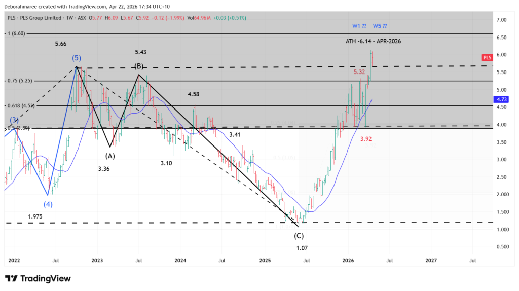
Start Learning Trading The Right WayOnline Trading – Chart 3 PLS – Weekly Chart – Fresh Highs, Structure Tension and What Comes Next
Chart 3 updates the weekly view with new information, and new information matters. Price has now pushed beyond the prior $5.66 high and printed a fresh all-time high near $6.14. That confirms strength, but strength alone does not automatically tell us which wave count is correct.
This is where disciplined analysis stays flexible.
From the major $1.07 low, price advanced into approximately $5.32, corrected into the $3.92 region, and then broke higher again into new highs. The current structure now presents 2 realistic possibilities.
Scenario 1: The advance from $1.07 is part of a larger bullish sequence, with the market now expanding into a higher-degree Wave 3. Under that view, the recent breakout is not the end of the story. It may be the beginning of a larger leg.
Scenario 2: The current rise is the final stage of a broader Wave 5 completing from the earlier cycle. Under that view, the move into new highs may be the last extension before a larger corrective phase eventually develops.
The 100% measured extension from the prior corrective structure projects near the $6.60 region. That places the area above current price into an important structural zone. Markets often reveal their intent near measured targets, especially when they arrive after a strong trend.
You will also notice the pullback into $3.92 was relatively shallow compared with the earlier advance. That tells us momentum remained strong during the correction. Strong markets often retrace less deeply than weak markets, which is why the bullish interpretation cannot be dismissed.
The simple moving average adds another layer of context. Price recovering above a rising moving average suggests trend pressure has improved. It does not confirm a guaranteed outcome, but it supports the idea that buyers have regained control for now.
So the real question is no longer whether PLS is strong. The real question is whether this breakout is an early expansion phase or a late-stage extension.
That answer does not come from guessing. It comes from watching how price behaves next. Clean continuation, constructive pullbacks, and support holding would strengthen the bullish expansion view. Failure after extension and sharp rejection would strengthen the completion view.
This is how professional chart work is done. We map the scenarios, define the important zones, and let future behaviour confirm which path is unfolding.
Online Trading – Chart 3
Online Trading – Chart 4 PLS Weekly Chart – Fresh High, Momentum Check and Structure Tension
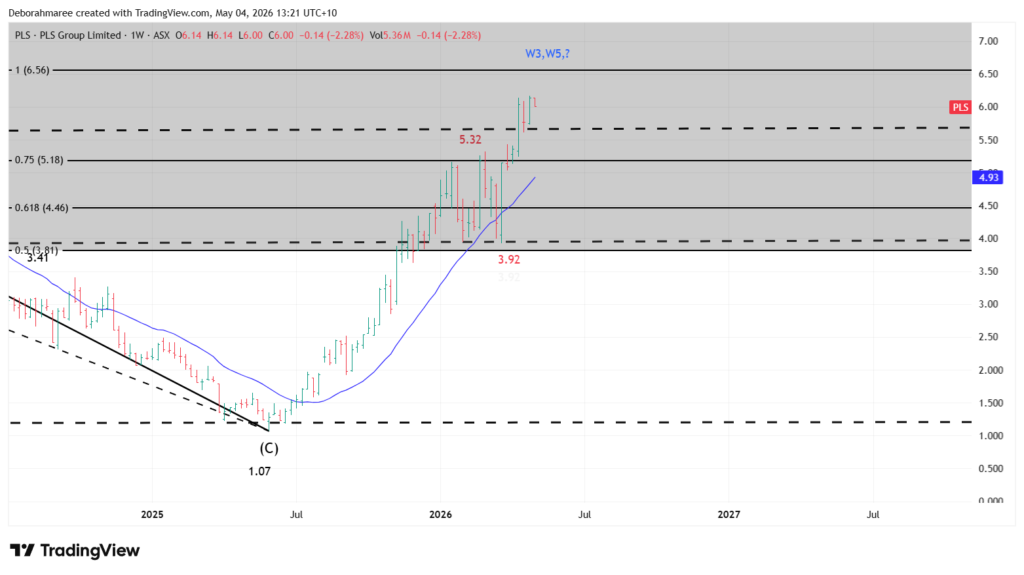
Date updated: 4 May 2026
Chart 4 continues from Chart 3. In Chart 3, PLS had already pushed beyond the prior structure and was testing whether the move from the $1.07 low was developing into a larger bullish expansion or completing as a final-stage extension.
This updated weekly chart now gives us new information. Price has continued higher and pushed into a fresh all-time high near $6.17.
That matters because price has now moved beyond the prior $5.66 high. This confirms strength, but strength alone does not automatically tell us which Elliott Wave interpretation is correct. This is where disciplined chart reading must stay flexible.
From the major $1.07 low, price advanced into the $5.32 region, pulled back into approximately $3.92, and then pushed higher again into the new all-time high area. This creates 2 realistic scenarios.
Scenario 1: The advance from $1.07 is part of a larger bullish sequence, with the current move developing into a higher-degree Wave 3. Under this view, the move above the prior high may be the beginning of a larger expansion phase.
Scenario 2: The current rise is the final stage of a broader Wave 5 completing from the earlier cycle. Under this view, the move into new highs may be a late-stage extension before a larger corrective phase eventually develops.
The candle behaviour now matters. The recent weekly candles have pushed strongly from the $3.92 region into the $6.00 area, but the latest candle is showing hesitation near the highs. The move has not failed, but the candle size and location suggest price is now testing an important decision zone rather than moving freely through open space.
The RSI also needs to be read carefully. RSI moved into the upper range during the advance, confirming strong momentum. However, RSI is no longer accelerating as cleanly as price. This does not mean the trend has ended. It simply tells us that momentum should be watched closely while price is extended near all-time highs.
The moving average adds another layer of context. Price remains above a rising moving average, which supports the view that trend pressure has improved. A rising moving average underneath price is constructive, but it is not a guarantee that price will continue higher without a pullback.
PLS is strong, but it is also extended.
When price is making new highs, RSI is elevated, and candles begin to hesitate near an important resistance area, the job is not to guess the top. The job is to manage the position with discipline.
For anyone already holding the stock, this is where a trailing stop loss may become useful. A trailing stop is not used to predict the next move. It is used to protect open profit while still allowing the trend room to continue.
The strongest bullish interpretation would require price to keep holding above the breakout area and continue expanding with strong weekly candles. If that happens, the higher-degree Wave 3 view remains possible.
The weaker interpretation would develop if price fails to hold the breakout, loses momentum, and falls back into the prior structure zone. If that happens, the Wave 5 completion view becomes more important.
The real question is whether this breakout is the beginning of a larger expansion phase or the final extension of the current advance.That answer does not come from guessing. It comes from watching how price behaves next.Clean continuation, strong candle expansion, and support holding above the breakout area would support the bullish continuation view.
Failure after extension, smaller candles, weakening RSI, and a move back below key structure would strengthen the completion view.This is how professional chart work is done. We map the scenarios, define the important zones, manage risk, and let future price behaviour confirm which path is unfolding.
Online Trading – Chart 4
Ready To Build Real Trading Confidence?
Yes, Take Me Straight To The Sales Page.Online Trading – Chart 5 PLS – 3 Way Chart – Structure, Momentum and Participation
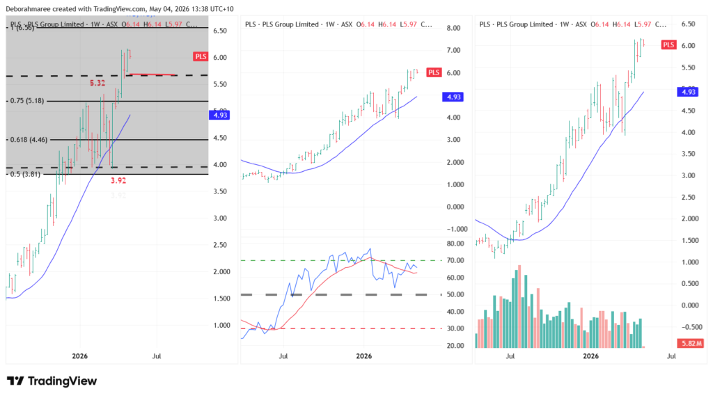
Chart 5 brings together three perspectives of the same move to reinforce how different tools are used together.
Chart 1 (Weekly Price Structure): This is the primary chart. It shows the bar-by-bar price movement, trend structure, and key levels. All decisions start here.
Chart 2 (RSI and Moving Average): RSI provides a view of momentum, while the moving average helps visualise the direction of the trend. These tools support what price is doing, but do not replace it.
Chart 3 (Moving Average and Volume): Volume reflects participation behind the move, while the moving average continues to show trend direction. Strong trends are often supported by consistent volume and a rising average.This three-way view reinforces a core principle: price leads, indicators confirm. Each tool adds context, but none should override the structure shown on the main chart.
Online Trading – Chart 5
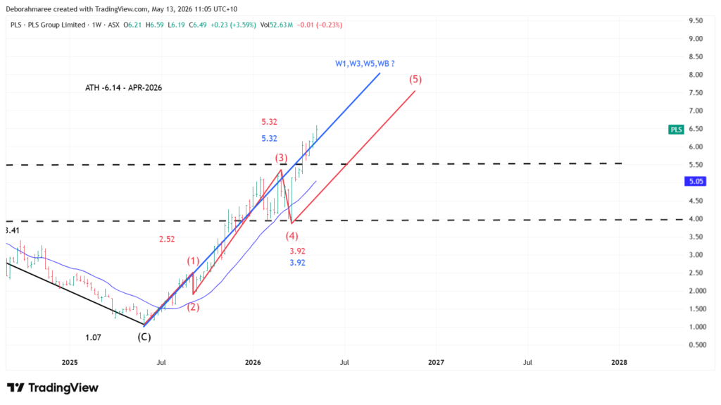
Online Trading – Chart 6 PLS – Weekly Internal Structure, Multi-Degree Wave Testing and What Happens Next
Chart 6 continues directly from the structure, momentum, and participation work introduced in Chart 5. However, as additional price behaviour developed, the structural interpretation also began evolving. Earlier analysis focused primarily on whether the move from the $1.07 low was developing into a larger bullish Wave 3 or completing as a final-stage Wave 5 extension. This updated chart now expands that investigation by also considering whether the current structure could be a new Wave 1 beginning, a larger Wave B rally, a continuing Wave 3, or a final Wave 5 extension.
This chart introduces multiple structural degrees operating at the same time. The blue structure represents the larger monthly impulsive framework originally mapped earlier in the analysis. The black structure represents the larger monthly A-B-C corrective sequence. The red structure represents the developing weekly internal sequence currently being tested from the $1.07 low.
From the $1.07 low, the current weekly structure can now be interpreted as a possible internal 5-wave advance. Under this interpretation, the move into approximately $2.52 may represent an internal Wave 1. The pullback into approximately $1.915 may represent an internal Wave 2. The expansion into approximately $5.32 may represent an internal Wave 3. The pullback into approximately $3.92 may represent an internal Wave 4. The current advance into the $6.50 region may now represent a possible internal Wave 5 testing an important extension zone.
This matters because the current structure may now be approaching a decision phase. If the internal 5-wave sequence is nearing completion, the next major pullback may help determine the larger-degree interpretation controlling the market. A constructive pullback followed by strong continuation behaviour would strengthen the possibility that the move from $1.07 is part of a larger bullish expansion. A deeper failure, momentum breakdown, or rejection back into prior structure would increase caution and keep the larger Wave B or completed Wave 5 possibilities in focus.
At this stage, the current advance could still represent several valid higher-degree possibilities. It could be the beginning of a new higher-degree Wave 1 from the $1.07 low. It could be part of a larger bullish Wave 3 expansion. It could be a final Wave 5 extension. Or it could still be a larger corrective Wave B rally within a broader A-B-C structure. The next pullback and the behaviour that follows will help separate these possibilities.
One important lesson from this chart is that multiple valid Elliott Wave interpretations can exist while a market is still developing. The goal is not to force certainty too early. The goal is to continuously test structure, behaviour, momentum, and proportion as new information becomes available.
This is why disciplined chart analysis must remain flexible. Professional analysis is not about defending one label. It is about mapping the probabilities, managing risk, and allowing future price behaviour to confirm which structure is actually unfolding.
Online Trading – Chart 6
This is Series 2 of the Online Trading Masterclass using PLS (ASX). If you have not yet seen Series 1 featuring ZIP (ASX), start there first to see how the framework was originally built, then return here to compare how the same structure applies to a different market.
Yes I’m Serious About Learning Trading Properly.
Take Me Straight To The Sales Page.PLS Fundamental Analysis – Lithium Growth Stock Overview
Alongside the technical analysis already covered throughout this masterclass, PLS Group also presents as a fundamentally different type of ASX stock compared to traditional defensive companies.
PLS operates inside the lithium and battery materials sector, making it one of the ASX lithium stocks closely connected to electric vehicle demand, battery supply chains, and long-term clean energy growth expectations.
Unlike mature dividend-focused businesses, PLS behaves more like a higher-growth ASX mining stock. This naturally creates larger share price swings, stronger momentum phases, and higher volatility during changing commodity market conditions.
PLS Growth Forecasts, Financial Health and Market Outlook
One of the strongest areas currently supporting the PLS share price is future growth expectations. Analysts are forecasting strong future earnings growth and revenue growth over the coming years as lithium market conditions continue stabilising from previous cycle weakness.
While past earnings performance weakened during the lithium downturn, the market is now focusing more heavily on future recovery potential, improving operational performance, and longer-term electric vehicle battery demand growth.
PLS also continues maintaining a relatively healthy balance sheet with substantial cash reserves and manageable debt levels. This provides the company with greater operational flexibility during periods of lithium price volatility and broader ASX mining sector uncertainty.
Explore PLS Financials, Valuation And Growth Forecasts
View PLS On Simply Wall StPLS Share Price Outlook and Fundamental Conclusion
From a broader perspective, PLS currently represents a higher-growth, higher-volatility ASX lithium stock whose future performance remains closely tied to lithium demand, battery technology expansion, and global electric vehicle adoption trends.
The combination of strong future growth forecasts, improving profitability expectations, and a solid financial position helps support the broader technical analysis structure already identified throughout this masterclass.
However, because PLS operates inside a cyclical commodity environment, both technical analysis and changing lithium market conditions remain extremely important to monitor moving forward.
Resorces 🔗
This is Series 2 of a 4 part series Online Masterclass including ZIP(ASX), PLS(ASX), QBE(ASX) – TLS(ASX) – “Coming Soon”
Once you have finished analizing this post you can then move on to the next Series featuring ZIP (ASX), PLS(ASX),TLS(ASX) Start here first, then click below to view the other masterclasses. You can then compare how the same structure applies to a different market. Once you’ve started learning the framework, you can explore additional tools, walkthroughs, and resources inside the She Trades Shares Hub
Trading for Beginners Guide – The Ultimate Resource Hub
Masterclass Series
View Online Masterclass ZIP – Series 1 Here
View Online Masterclass QBE – Series 3 Here
View Online Masterclass TLS – Series 4 Here