Online Trading – Masterclass – Challenger Limited (ASX: CGF) Technical Analysis & Market Structure

Online Trading – Masterclass – Challenger Limited (ASX: CGF)
Online Trading – Chart Structure Step-by-Step Analysis
This online trading masterclass examines Challenger Limited (ASX: CGF) as a real Australian market example of how long-term chart structure, shorter-term price behaviour and supporting technical indicators can be studied within one disciplined analytical framework. We will begin with the historical monthly chart, move into the weekly structure and then examine how volume, moving averages and momentum contribute additional information. The purpose is to demonstrate how market evidence can be organised and interpreted before any trading decision is considered.
Many beginners approach charts by looking for an indicator signal or a possible entry point before understanding the broader market structure. This can create confusion because individual signals may appear attractive while the higher-timeframe chart tells a different story. In this masterclass, we reverse that process by beginning with historical price behaviour, identifying important structural levels and examining how later market movements relate to those reference points.
You do not need to understand every technical measurement or indicator immediately. Each chart will introduce another layer of information and explain why that layer matters to the overall analysis. Our objective is not to predict Challenger’s next price movement or provide a trading signal. It is to demonstrate how structured observation can replace guesswork with a repeatable educational process.
Understanding the Type of ASX Company You Are Looking At
Challenger Limited operates in Australia’s financial services sector, with a particular focus on retirement income products, annuities and investment management. Unlike a general insurance company such as QBE, Challenger’s business is closely connected to helping customers manage income and financial security during retirement. Its activities include managing investments and providing financial products designed to support retirement income needs. This creates a different set of business drivers and risks from those affecting companies in resources, technology or general insurance.
Challenger’s performance can be influenced by interest rates, investment returns, capital requirements, customer demand for retirement income products and the management of long-term financial obligations. Changes in market conditions can affect both the assets supporting these obligations and the assumptions used to assess them. This is why a financial services company should not be evaluated through its share price alone. Technical analysis and fundamental research provide different but complementary perspectives on the business and its market behaviour.
Online Trading – Why Challenger Limited (CGF) Was Selected
Challenger was selected because its chart provides an opportunity to examine how a long-term financial services company moves through substantial market cycles, extended corrections and periods of recovery. The historical monthly structure contains several significant turning points and retracement regions that can be mapped before examining the more recent price action. This makes CGF a useful educational example for understanding how historical price levels can remain relevant across different market conditions.
The weekly chart also provides a practical example of how a recovery can develop through successive advances and corrective movements. Rather than treating every upward movement as a confirmed new trend, we can examine where price encountered resistance, where selling pressure emerged and how subsequent buying activity developed. These observations help distinguish established price behaviour from interpretations that still require confirmation.
Another reason for selecting Challenger is that we can examine the relationship between price structure and supporting indicators. Volume provides information about trading participation, moving averages help visualise the broader direction of price, and the Relative Strength Index (RSI) offers a perspective on momentum conditions. None of these indicators replaces the importance of actual price movement, but each can contribute useful context when interpreted carefully.
Finally, Challenger offers a valuable fundamental case study because its financial results, dividend characteristics and balance-sheet obligations introduce considerations that are not immediately visible on a chart. By combining technical observations with company research, readers can begin understanding why a share price may recover while important financial uncertainties still remain. This reinforces the She Trades Shares principle that market preparation should consider evidence from more than one perspective.
How to Follow This CGF Masterclass
We will begin with Challenger’s monthly chart because it establishes the historical framework within which the more recent market movements have developed. From there, we will move into the weekly timeframe to examine individual swing highs, swing lows and corrective phases. Additional charts will then introduce volume, moving averages and momentum analysis before we review the company’s fundamental position.
Each chart builds directly on the previous one, allowing the analysis to develop logically rather than becoming a collection of unrelated indicators. The goal is to understand what the evidence shows, recognise what remains uncertain and appreciate why preparation matters before execution. This is the foundation of disciplined market analysis: structure before strategy and risk before execution.
Online Trading – Chart 1 – CGF Monthly Historical Market Structure
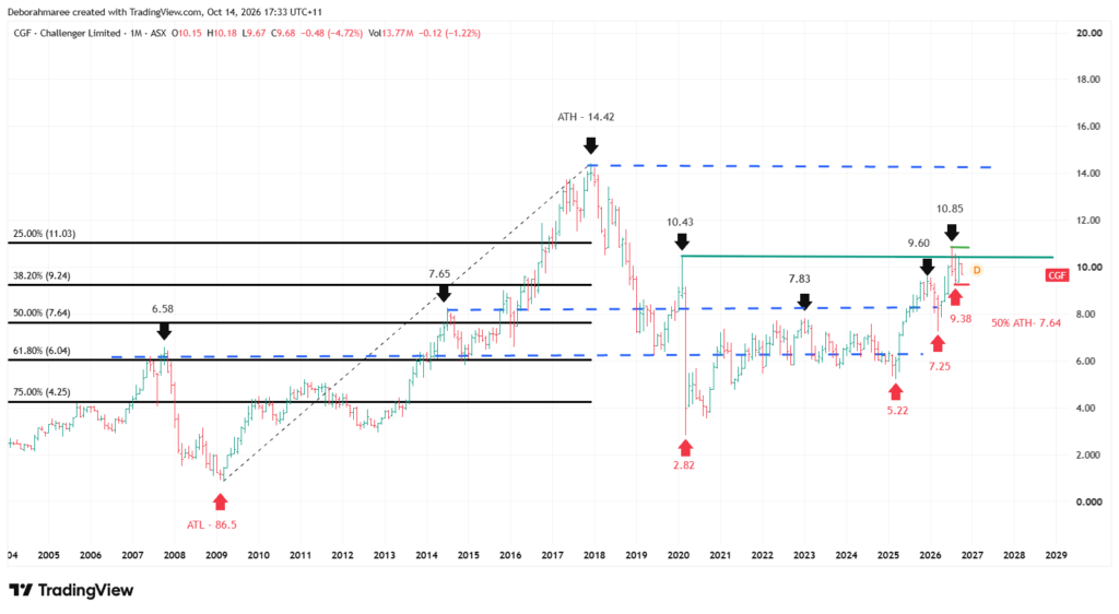
Online Trading – Chart 1 – CGF Monthly Chart Structure
Take a moment to study this first chart carefully. This is Challenger Limited’s monthly chart, showing the broader historical price structure before we examine the more recent movements in detail. Each monthly candle represents approximately one month of trading activity, allowing us to step away from shorter-term market fluctuations and observe how major advances, corrections and recovery phases have developed over time. This is the first structural layer of our Challenger market analysis.
Establishing the Long-Term Historical Framework
The monthly chart identifies Challenger’s historical high at $14.42, reached around 2018, alongside the major historical low established during the 2009 market cycle. These two extremes provide the reference range for the proportional retracement measurements displayed across the chart. By establishing the broader range first, we can assess where later price movements sit in relation to Challenger’s longer-term market history rather than examining recent prices in isolation.
Between these historical extremes, the chart identifies several important proportional retracement levels. The 25% level is marked at $11.03, the 38.2% level at approximately $9.24, the 50% level at $7.64, the 61.8% level at $6.04 and the 75% level at $4.25. These levels divide the historical price range into measurable regions and help establish a consistent framework for evaluating the scale of advances and corrections. They are reference levels, not guaranteed areas of support or resistance.
Understanding Challenger’s Major Historical Price Movements
Challenger’s long-term chart demonstrates that an established financial services company can still experience substantial changes in market value across different economic and investment cycles. Following earlier periods of recovery, price eventually advanced toward the historical $14.42 high before entering a much broader corrective phase. The subsequent decline included a significant low around $2.82 during 2020, demonstrating how deeply market conditions can affect even established businesses.
From that major low, Challenger developed a recovery containing several distinct advances and corrections rather than one uninterrupted upward movement. Historical reference points around $7.65, $7.83, $9.60 and $10.43 help illustrate where price previously encountered important changes in behaviour. These levels are useful because they allow us to compare the current market position with areas that have already influenced price.
Why the $9.24 and $11.03 Retracement Levels Matter
One of the most relevant areas on the monthly chart is the region surrounding the 38.2% retracement level at $9.24. With Challenger trading around the $10 region at the time of this analysis, price is positioned above that reference level but remains below the 25% retracement level at $11.03. This places the recent recovery inside an important section of the wider historical range.
The significance of this region is not that price must automatically move toward the next retracement level. Instead, the chart provides a framework for observing whether the market can sustain trading above previously tested areas or whether renewed selling pressure begins to weaken the recovery. The $11.03 region provides a higher historical reference, while $9.24 remains relevant when evaluating the strength of the current structure.
Support, Resistance and the Importance of Previous Turning Points
In addition to proportional retracement levels, the chart contains horizontal reference lines based on previous price behaviour. These represent areas where Challenger has historically stalled, reversed, consolidated or experienced renewed momentum. Important historical reference points include the regions around $6.58, $7.65 to $7.83, $9.60 and $10.43.
These levels should not be interpreted as precise barriers that price can never cross. Markets frequently move temporarily above or below historical levels before revealing whether a breakout, rejection or consolidation is developing. The purpose of marking these regions is to identify where future price behaviour deserves closer observation, not to predict the outcome in advance.
What the Monthly Chart Tells Us About the Current Recovery
The most recent portion of Challenger’s monthly chart shows a recovery from the lower price regions established during previous corrective phases. However, the broader historical framework also shows that price remains below the $14.42 high. This distinction is important: a substantial recovery does not automatically mean that the entire long-term market structure has completed a bullish reversal.
At this stage, the monthly chart provides a structured set of observations. We can identify the major historical range, measure proportional retracements, locate previous turning points and observe the position of current price within that framework. What we cannot establish from this chart alone is whether the next movement will be a continuation, consolidation or deeper correction.
Why We Move From the Monthly Chart to the Weekly Chart
The monthly chart establishes the structural foundation, but it does not show every individual movement developing inside the recent recovery. To examine that behaviour more closely, we need to move into the weekly timeframe. This allows us to study the sequence of swing highs, swing lows and corrective movements without losing sight of the larger historical framework.
This is an important part of disciplined technical analysis. We do not begin with the smallest price movement and then attempt to invent a larger market explanation. Instead, we establish the broader structure first and use the lower timeframe to examine how price is behaving within it. That is how each layer of the analysis earns its place.
Want To Learn How To Build Market Structure Step By Step?
Start Learning Trading The Right WayOnline Trading – Chart 2 – CGF Weekly Price Structure and Market Behaviour
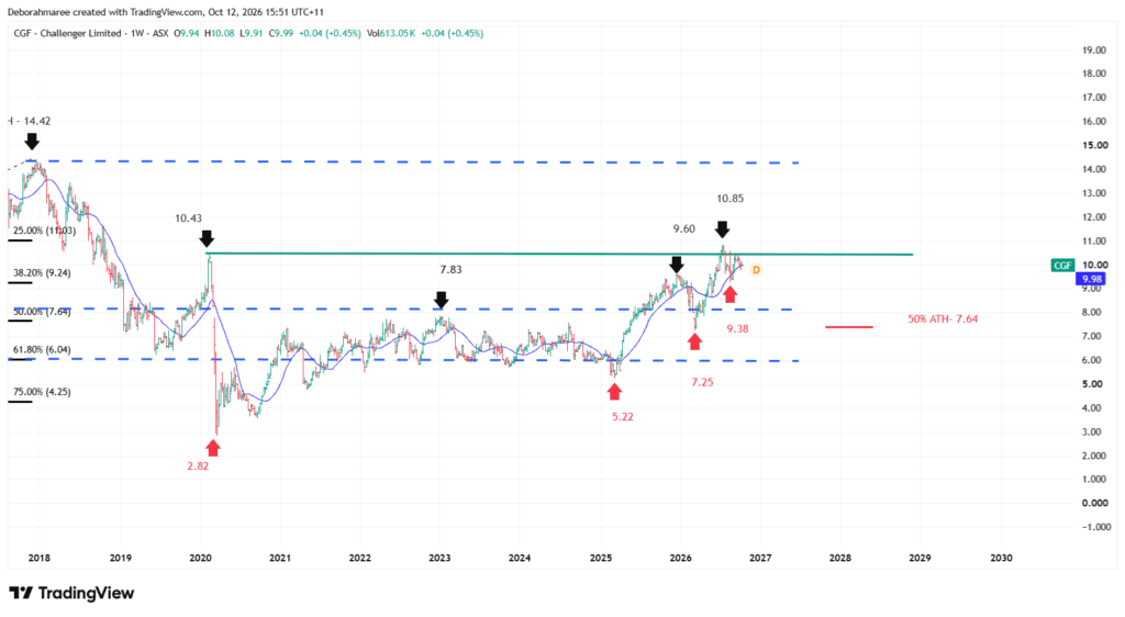
Online Trading – Chart 2 – CGF Weekly Price Structure and Market Behaviour
This chart now moves from Challenger Limited’s long-term monthly structure into the weekly timeframe, allowing us to examine the individual price movements developing inside the broader recovery. While the monthly chart established the historical market range, proportional retracement levels and major support and resistance regions, the weekly chart provides a clearer view of how buyers and sellers have responded during the more recent market cycle.
Each weekly candle represents approximately one week of trading activity. This timeframe allows us to identify meaningful swing highs and swing lows without becoming distracted by every smaller daily price movement. Our objective is to understand the sequence of advances and corrections, recognise where market behaviour has changed and identify which structural levels remain relevant as new price information develops.
Understanding Challenger’s Recovery From the 2025 Low
The weekly chart shows a substantial recovery developing from the lower price region established during 2025. Following that period of weakness, Challenger began producing a series of advancing price movements that eventually carried the share price toward the $9.60 region. This advance is important because it demonstrates how a market can move from a period of lower prices into a more constructive recovery without advancing in one uninterrupted direction.
The $9.60 area became an important reference because it marked a meaningful high within the developing weekly structure. After reaching that region, price experienced a corrective decline toward approximately $7.25. This movement illustrates a fundamental principle of market structure: an upward recovery can contain substantial corrections, and those corrections need to be examined in relation to the previous swing highs and lows.
The $7.25 Corrective Low and Subsequent Advance
The corrective movement into the $7.25 region provides an important reference point for evaluating Challenger’s subsequent recovery. Rather than continuing directly lower, price advanced from this region and eventually moved beyond the earlier $9.60 high. This change in behaviour is significant because it demonstrates that the market was capable of recovering from the correction and establishing a higher weekly price high.
The advance eventually reached approximately $10.85, creating another clearly identifiable swing high within the weekly structure. This movement carried Challenger above the previous $9.60 reference point and closer to the $11.03 proportional retracement level identified on the monthly chart. However, reaching a higher price does not automatically confirm that the market will continue advancing. We must also examine how price behaves after reaching that higher region.
Why the $10.85 High Matters
The $10.85 region is one of the most important recent reference points on Challenger’s weekly chart. It represents the highest marked price in the recent recovery sequence and provides a clear level against which future market behaviour can be compared. When price approaches a previous swing high, the important question is whether the market can sustain movement beyond that region or whether selling pressure begins to reappear.
The proximity of the $10.85 high to the monthly $11.03 retracement level also makes this an interesting area of higher-timeframe context. The two measurements are not identical and should not be treated as a single guaranteed resistance barrier. However, their proximity gives us a reason to monitor how price behaves around this broader region rather than concentrating on one exact number.
The Pullback Toward $9.38
Following the advance into the $10.85 region, Challenger experienced another corrective movement that brought price back toward approximately $9.38. This pullback is important because it allows us to examine how the market responded after reaching a higher swing high. A correction following an advance is not, by itself, evidence that the entire recovery has failed.
The $9.38 region now provides a recent weekly reference point within the developing structure. At the time of this analysis, Challenger had recovered toward approximately $10.00, placing price between the recent $9.38 corrective low and the $10.85 swing high. This means the market is still operating inside a clearly identifiable recent price range, with neither a sustained move above the high nor a decisive breakdown beneath the low established by the chart.
How the Weekly Structure Connects to the Monthly Chart
One of the most valuable lessons from this chart is how the weekly movements fit inside the larger monthly framework. The $7.25 corrective low developed close to the broader historical region surrounding the monthly 50% retracement at $7.64. Meanwhile, the subsequent advance toward $10.85 approached the monthly 25% retracement at $11.03. These relationships demonstrate why higher-timeframe measurements should remain visible when studying shorter-term price behaviour.
The monthly chart provides historical context, while the weekly chart explains how price has travelled between important regions. Neither timeframe should be interpreted independently of the other. A level that appears important on the weekly chart may become more meaningful when it sits near a major monthly reference point, but the market’s actual reaction remains the evidence that matters.
What the Current Weekly Structure Does and Does Not Confirm
Challenger’s weekly chart shows a recovery that has included meaningful upward advances, corrective movements and the establishment of a higher swing high at $10.85. These are observable characteristics of the recent price structure. However, they do not establish that the next movement must continue higher, nor do they confirm that the broader historical recovery is complete.
At this stage, the $10.85 region remains an important upper reference, while $9.38 represents a recent corrective low. The earlier $9.60 and $7.25 regions also remain relevant to the wider weekly structure. Future price behaviour around these levels will provide additional evidence about whether the recovery is strengthening, consolidating or entering a deeper corrective phase.
Why Price Structure Comes Before Indicators
Before introducing any additional technical indicators, we have already identified Challenger’s historical framework, its recent recovery sequence, the corrective movements within that recovery and the most important weekly reference points. This gives us a structural foundation against which other information can be assessed.
Indicators become more useful when we understand the price movements they are measuring. A moving average may help visualise the broader direction of price, while volume can show how trading activity changes during advances and corrections. However, neither should replace the swing highs, swing lows and historical levels already established on the chart.
The next chart therefore builds directly on the weekly structure we have just examined. We will retain the underlying price behaviour and introduce the moving average and volume information to see what additional context they provide. This continues our disciplined progression from market structure into supporting technical evidence, without treating any individual indicator as a prediction or trading signal.
Online Trading – Chart 3 – CGF Weekly Moving Average Analysis
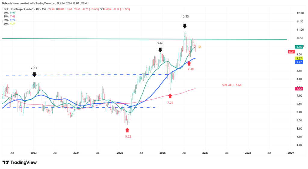
Online Trading – Chart 3 – CGF Weekly Moving Average Analysis
Chart 3 builds directly on the weekly price structure examined in the previous chart. We have already identified Challenger Limited’s important swing highs, corrective movements and historical reference levels. We are now introducing three simple moving averages to examine how the recent recovery relates to the short, intermediate and longer-term direction of price.
The Green line represents the 20-week simple moving average (SMA), the Blue line represents the 50-week SMA, and the red line represents the 200-week SMA. Each is calculated using historical weekly closing prices, but over a different number of weeks. A moving average smooths some of the fluctuations in price, helping us observe the underlying direction of a market. However, because it is calculated from prices that have already occurred, it is a lagging indicator. It does not predict Challenger’s next share-price movement.
What the 3 Moving Averages Show on Challenger’s Weekly Chart
The 3 moving averages provide different perspectives on the same price history. The 20-week SMA, shown in Green , responds more quickly to recent changes in price. It helps us examine how the developing weekly trend behaves as Challenger advances, corrects or consolidates. The 50-week SMA, shown in Blue, provides an intermediate-term reference. Because it uses a longer calculation period, it generally responds more slowly than the 20-week SMA and helps smooth out shorter-term fluctuations.
The 200-week SMA, shown in red, represents a substantially longer period of historical closing prices. It provides context for the broader trend and generally changes direction more slowly than the other two averages. These 3 averages should not be interpreted as three independent predictions. They are different calculations applied to the same underlying price information.
Understanding Challenger’s Recovery Through Moving Averages
Challenger’s weekly chart shows a recovery from earlier corrective regions, followed by an advance toward the marked high near $10.85 and a subsequent pullback toward $9.38. The moving averages help us examine this sequence from different perspectives. The shorter averages respond more closely to recent price behaviour, while the 200-week average provides a slower-moving reference to the longer-term price history.
This distinction matters because a correction can develop even while the longer-term moving average continues rising. The shorter averages may react sooner, but that does not automatically make them more reliable. Our primary evidence remains the actual sequence of weekly swing highs, swing lows and corrective movements. The moving averages provide supporting context rather than replacing that structural analysis.Understanding the Relationship Between Price and the Moving Averages
When price trades above a rising moving average, it indicates that the current market price is above its average closing price over the selected calculation period. This can be consistent with constructive trend conditions, particularly when the underlying chart also shows advancing swing highs.
However, the interpretation depends on which average we are examining. A movement through the 20-week SMA may reflect a relatively recent change in price behaviour. A movement through the 50-week SMA may provide additional intermediate-term context. The 200-week SMA represents a much longer historical calculation and should not be interpreted in exactly the same way as the shorter averages. None of these relationships guarantees that a trend will continue, that a correction has finished or that a reversal is developing.Why the $10.85 High and $9.38 Low Still Matter
The moving averages do not replace the structural reference points established in Chart 2. The $10.85 region remains Challenger’s recent marked swing high, while $9.38 represents an important corrective low. With the share price trading around the $10 region at the time of this analysis, these levels provide a practical framework for observing how the current weekly structure develops. If price moves toward the previous high, the important evidence will be how the market behaves around that region. If price moves lower, we can examine its relationship with the recent swing lows and the 3 moving averages. The objective is not to predict which movement will occur. It is to understand what the developing price behaviour reveals about the existing structure.
Why Moving Averages Are Not Automatic Support or Resistance
Beginners are sometimes taught that moving averages automatically act as support or resistance. This is an oversimplification. Price may react near an average, move through it, consolidate around it or continue in the opposite direction without producing a meaningful reversal. When a moving average sits near an established historical price level, that relationship may provide useful analytical context. However, the two references are different. One comes from observed market turning points, while the other is calculated from historical closing prices. Even when several moving averages appear close together, their proximity does not guarantee that price will respond in a particular way.
Understanding the Limitations of Three Moving Averages
Moving averages simplify price information, but this simplification creates limitations. During sideways or overlapping market conditions, price can repeatedly cross the 20-week and 50-week averages without establishing a sustainable trend. The 200-week average may continue rising or falling long after shorter-term price behaviour has changed because it incorporates a much longer historical period. The relationship between the three averages can therefore provide context about different trend horizons, but it cannot independently establish a trading opportunity. This is why our masterclass examines moving averages only after identifying the actual market structure.
What Chart 3 Adds to Our CGF Analysis
The first monthly chart established Challenger’s long-term historical framework. The second chart examined the weekly recovery, corrective movements and important swing levels. Chart 3 now introduces the 20-week, 50-week and 200-week simple moving averages, allowing us to compare recent, intermediate and longer-term price behaviour within the same weekly timeframe. Each moving average contributes a different perspective, but none replaces the evidence established through price structure. The disciplined approach is to examine how the market develops, recognise the limitations of lagging indicators and avoid treating moving-average relationships as automatic trading signals.
Why We Examine Volume Next
So far, our analysis has concentrated primarily on price structure and the direction of historical price movement. The next stage introduces trading volume, which measures the number of shares traded during a selected period. Volume allows us to examine changes in trading activity alongside the advances and corrections already identified on Challenger’s chart. Volume does not tell us with certainty whether institutions are buying or selling, and a large volume bar does not automatically confirm a breakout or reversal. Instead, we will study how trading activity changes around important price movements and what that information contributes to our broader structural analysis.
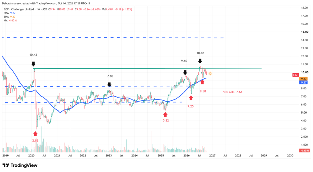
Online Trading – Chart 4 – CGF Weekly Volume Analysis
Chart 4 builds directly on the weekly price structure and moving average analysis examined in the previous charts. We have already identified Challenger Limited’s major recovery movements, corrective phases and important price levels. We are now introducing trading volume to examine how market participation has changed during those movements. This provides another layer of information without replacing the underlying price structure.
The vertical bars displayed beneath the weekly price chart represent trading volume. Each bar shows the number of Challenger shares traded during the corresponding weekly period. Taller bars represent greater trading activity, while shorter bars represent lower activity. Volume measures the amount of trading that occurred, but it does not independently establish whether buyers or sellers will control the next movement.
Understanding Volume Within Challenger’s Weekly Structure
One of the first observations from Challenger’s weekly volume chart is that trading activity has not remained constant throughout the historical period. Some weeks display noticeably larger volume bars, while others show considerably less activity. This variation is normal because market participation can change in response to company announcements, economic conditions, investor expectations and broader financial market events.
The chart contains periods of elevated volume during the earlier 2024 and 2025 price movements. These bars show that more shares changed hands during certain weeks compared with surrounding periods. However, higher volume alone does not establish whether those transactions represented long-term investment accumulation, short-term trading, portfolio adjustments or other activity. We must examine the corresponding price candles before drawing broader conclusions.
Why Volume Must Be Analysed Alongside Price
Volume becomes more useful when it is compared with the price movement occurring during the same period. For example, an advancing weekly candle accompanied by unusually high trading volume indicates that the price advance occurred during a period of greater market activity. A declining candle accompanied by elevated volume similarly shows that the decline occurred while more shares were being traded.
Neither observation automatically confirms that a new trend has begun. A large volume increase may occur during a breakout attempt, a reversal, a company announcement or a temporary period of heightened uncertainty. This is why professional analysis considers the position of the candle, its relationship to previous support and resistance levels, and the behaviour that follows.
Volume During Challenger’s Recovery and Corrections
Challenger’s weekly price structure shows a recovery that advanced toward $9.60 before correcting toward approximately $7.25. Price subsequently recovered and established a higher swing high near $10.85. These movements provide identifiable periods against which changes in weekly trading activity can be examined.
When studying these movements, the objective is to compare the relative size of the volume bars during advances, corrections and periods of consolidation. A stronger price advance accompanied by increasing activity may suggest greater participation in that movement. However, this remains a contextual observation rather than proof that the advance will continue.
The same principle applies during corrective movements. A decline accompanied by increasing volume can indicate heightened trading activity during the selling phase, but it does not reveal the complete intentions of market participants. A correction occurring on lower volume may also be worth observing, although lower activity does not guarantee that the correction is finished.
Examining the $10.85 High and $9.38 Pullback
The recent advance toward $10.85 and subsequent pullback toward $9.38 provide a particularly useful example of why volume should be interpreted within an established price framework. We already know where the recent swing high and corrective low occurred. Volume now gives us an additional way to compare trading activity during those movements.
The important question is not simply whether one volume bar was larger than another. We also need to consider whether trading activity changed as price approached the previous high, moved into correction and began recovering. These observations may help describe the character of the movement, but they do not confirm whether Challenger will break above $10.85 or revisit $9.38.
Why a Volume Spike Is Not Automatically a Buy or Sell Signal
Beginners sometimes assume that a large volume bar means institutional investors are buying shares. This is not a conclusion that can be established from a standard volume chart alone. Every completed transaction involves both a buyer and a seller, and the volume bar does not identify the intentions or investment horizons of those participants.
Elevated volume may accompany significant market developments, but its interpretation depends on the surrounding price behaviour. A high-volume week near resistance may develop differently from a high-volume week following a prolonged decline. This is why volume should be treated as supporting evidence rather than a stand-alone instruction to trade.
Understanding the Limitations of Weekly Volume
Because this chart uses the weekly timeframe, each volume bar combines the trading activity recorded across that entire week. It does not show every individual change in activity occurring within the trading sessions. The weekly view is useful for identifying broader participation patterns, but it should not be confused with a detailed intraday order-flow analysis.
Volume can also change because of factors unrelated to a sustained change in market direction. Index adjustments, company announcements, large transactions and changes in overall market conditions can influence trading activity. For this reason, one unusual volume bar should not outweigh the broader price structure established across the previous charts.
What Chart 4 Adds to Our Challenger Analysis
Our analysis began with Challenger’s long-term monthly framework before examining the weekly recovery, corrective movements and major swing levels. We then introduced the moving average to observe the broader direction of price. Chart 4 now adds trading volume, allowing us to consider how participation has varied throughout those movements.
Together, these layers provide a more complete description of Challenger’s market behaviour than any single indicator could provide independently. However, none removes the uncertainty associated with future price movements. The purpose of this masterclass is to demonstrate how evidence can be organised, compared and interpreted without turning observations into predictions.
Why We Examine Momentum Next
Price structure shows where Challenger has advanced and corrected, while the moving average provides a smoothed view of the broader price direction. Volume adds information about trading activity during those movements. Our next analytical layer will examine momentum using the Relative Strength Index, commonly known as RSI.
RSI measures the relative strength of recent upward and downward price changes over a selected calculation period. It can help us examine whether momentum is strengthening, weakening or moving through a more neutral region. Like the moving average and volume, RSI must be interpreted alongside price structure rather than used as an automatic trading signal.
Online Trading – Chart 5 – CGF Weekly RSI Momentum Analysis
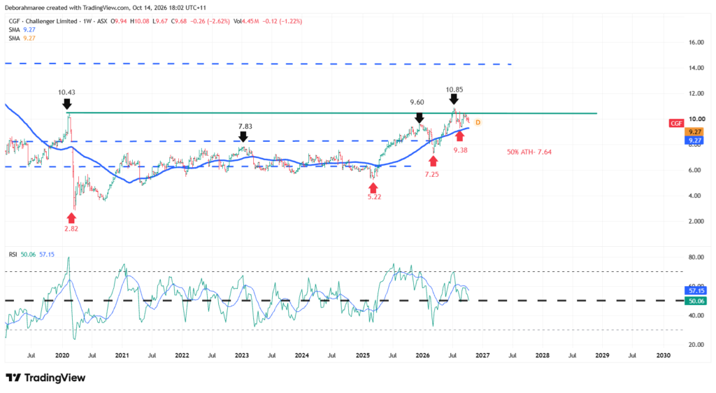
Online Trading – Chart 5 – CGF Weekly RSI Momentum Analysis
Our final technical chart introduces the Relative Strength Index, commonly known as RSI. Until this point, we have examined Challenger Limited’s long-term historical price structure, its more recent weekly movements, the relationship between price and its moving averages, and the trading activity represented by volume. RSI adds another perspective by measuring the relative strength of recent upward and downward price changes.
This is an important distinction for beginners. RSI does not measure the financial strength of Challenger as a business, nor does it tell us whether the shares are fundamentally expensive or inexpensive. It is a technical momentum indicator derived from historical price movements. Its purpose in this masterclass is to help us understand the character of recent price momentum within the market structure we have already established.
Understanding the RSI Indicator
The Relative Strength Index operates on a scale from zero to 100. We are using the standard 14-period RSI calculation on Challenger’s weekly chart, meaning the indicator measures momentum using recent weekly price changes. The calculation compares the magnitude of upward price movements with the magnitude of downward price movements over its selected period.
Three reference levels are particularly useful when learning to interpret RSI. The 70 level is commonly associated with overbought momentum conditions, while the 30 level is commonly associated with oversold conditions. The 50 level provides a central reference for comparing the relative strength of upward and downward momentum. These levels help organise observations, but they do not provide guaranteed reversal points.
What Challenger’s Current Weekly RSI Shows
On the weekly chart prepared for this masterclass, Challenger’s RSI is positioned in the middle portion of its range, around the mid-50s. This places the indicator above the neutral 50 reference level, but below the commonly watched 70 overbought threshold. It indicates that recent upward price changes retain some relative strength compared with downward changes over the calculation period.
However, an RSI reading in the mid-50s does not establish that a new upward movement is about to begin. It is better understood as a description of the momentum currently reflected in the historical data. The indicator is not showing an extreme overbought or oversold reading, and its position alone does not confirm whether Challenger will move above its recent high or begin another correction.
RSI Behaviour During the Weekly Recovery
The weekly price chart shows Challenger recovering from its earlier 2025 lows and advancing through a series of important price movements. During stronger advancing phases, the RSI also moved higher, reflecting the increased strength of upward price changes. This relationship is useful because it demonstrates how momentum can respond as the character of price movement changes.
The recovery was not uninterrupted. Challenger advanced toward $9.60, corrected toward $7.25, and subsequently moved higher to establish a more recent swing high near $10.85. These advances and corrections provide the historical context needed to interpret the RSI line. Rather than viewing every RSI movement as a separate trading opportunity, we examine whether it is consistent with the price movement occurring at the same time.
Momentum Following the $10.85 High
Challenger’s movement toward the $10.85 region was followed by a correction toward approximately $9.38. The RSI subsequently moved away from its earlier stronger readings and returned toward the middle of its range. This is consistent with a moderation in momentum following the preceding advance.
With price trading around the $10 region at the time of this analysis, the RSI provides useful context for understanding the recovery following that correction. However, price remains below the recent $10.85 swing high, and the current RSI reading does not establish that the previous high will be exceeded. The developing weekly candles and their relationship to established structural levels remain essential.
Understanding the RSI Moving Average
The RSI panel also displays a separate smoothing line associated with the indicator. This line is calculated from RSI values, rather than directly from Challenger’s share price. It helps smooth some of the shorter-term fluctuations in momentum and provides an additional reference for observing changes in the RSI’s direction.
When the RSI and its smoothing line move closer together or cross, this can indicate a change in the recent relationship between momentum and its average. However, crossings can occur repeatedly during sideways conditions and may not correspond with a lasting change in price direction. For this reason, we do not treat an RSI crossover as an automatic buy or sell signal.
Why Overbought Does Not Automatically Mean Sell
One of the most common beginner misunderstandings is that an RSI reading above 70 means a share must immediately fall. In reality, RSI can remain elevated during a strong advancing trend. An overbought reading describes the strength of recent upward price changes; it does not guarantee that the movement has finished.
The opposite applies to readings below 30. An oversold reading does not automatically mean a share has reached its final low or is about to recover. Strong downward movements can keep RSI depressed for extended periods. The indicator must always be considered alongside price structure, market conditions and risk.
Why Price Structure Remains More Important Than RSI
For Challenger, the recent $10.85 high and $9.38 corrective low remain important weekly reference points. The RSI helps describe the momentum associated with movements between and around these regions, but it cannot replace the actual evidence provided by the price candles.
If Challenger approaches the previous high, we would examine the developing price structure and consider whether momentum is strengthening, weakening or remaining relatively unchanged. If price moves toward the corrective low, the same approach applies. Neither outcome should be assumed simply because RSI is above or below a particular level.
What Chart 5 Adds to Our Analysis
RSI completes the technical indicator portion of this Challenger masterclass. The moving averages helped us observe the direction of average historical prices, volume showed how trading activity varied, and RSI has now provided a measure of recent price momentum. These indicators answer different questions, which is why we examine them separately.
None of these indicators should be interpreted as a prediction of Challenger’s next price movement. Their educational value comes from helping us organise evidence and recognise when market conditions may be changing. Our starting point remains the price chart itself, supported by the broader historical framework.
Bringing the CGF Technical Analysis Together
We have now completed five chart-based stages of technical analysis for Challenger Limited. Each stage was introduced separately so beginners could understand what information it contributes before combining the observations into a broader assessment. This is an important part of developing a repeatable analytical process.
Long-Term Historical Structure
The monthly chart established the wider historical framework, including Challenger’s major historical high near $14.42 and significant proportional retracement regions. This helped us understand that recent price movements exist within a much larger market history. The monthly chart provides context that would be easy to overlook when concentrating only on recent weekly candles.
Weekly Price Structure
The weekly chart then allowed us to examine the recovery and its corrective movements in greater detail. We identified the advance toward $9.60, the correction toward $7.25, the subsequent high near $10.85 and the pullback toward $9.38. These movements form the most immediate structural framework for observing Challenger’s developing weekly behaviour.
Moving Averages, Volume and Momentum
The moving averages added a smoothed perspective on price direction, while the volume chart introduced the changing level of trading activity. RSI then provided information about the relative strength of recent price movements. Together, these observations help describe the market environment, but they do not remove uncertainty about what happens next.
What Is Established and What Remains Uncertain
At the time of this analysis, Challenger has demonstrated a substantial recovery from its earlier lows and has established identifiable weekly swing points. The current price is below the recent $10.85 high and above the $9.38 corrective low. This describes the present structural position without assuming the direction of the next significant movement.
A continued advance, another corrective phase or a period of sideways movement are all possible. Our charts provide reference points for evaluating developing evidence, not certainty about which scenario will occur. This distinction is central to responsible trading education and reinforces why risk must be considered before execution.
Why Technical Analysis Is Only Part of the Research
Technical analysis helps us understand how Challenger’s shares have behaved in the market. However, price charts do not independently explain the company’s earnings, financial position, dividend sustainability, valuation or future business risks. These questions require a different type of research.
Challenger operates within the financial services industry, with exposure to retirement income products, annuities and investment management. Understanding this business context is particularly important because financial services companies can have balance-sheet structures and risk exposures that differ considerably from ordinary industrial businesses.
We will now move beyond the chart and examine Challenger’s fundamental information. This next stage will consider earnings, valuation, financial health, dividends, growth expectations and the risks that may influence the business. Our objective is not to decide whether readers should buy or sell CGF shares, but to demonstrate how technical and fundamental research can contribute different evidence to an informed educational assessment.
Want To Learn How To Bring Your Trading Analysis Together?
Explore The Complete Trading For Beginners FrameworkOnline Trading – Chart 6 – CGF Monthly Elliott Wave Structure and Fibonacci Extension
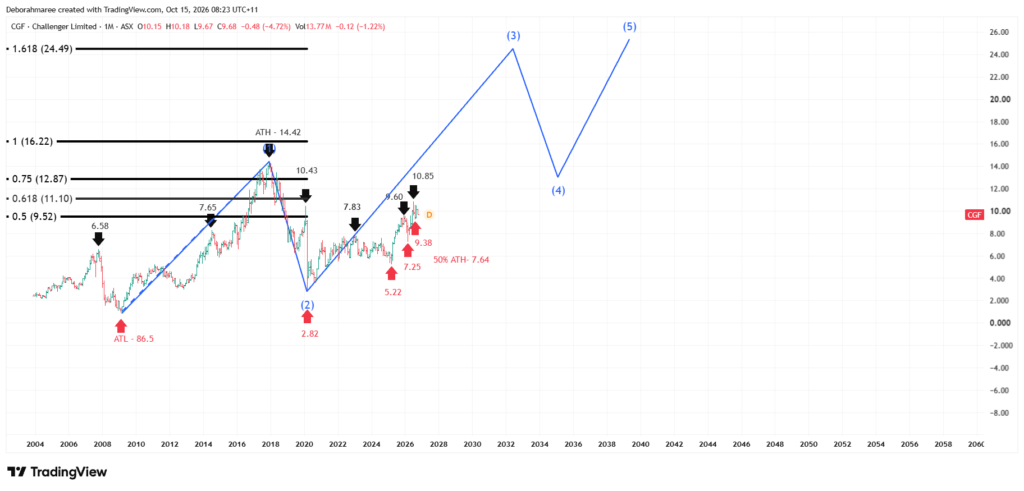
Online Trading – CGF Monthly Elliott Wave Structure and Extension
Challenger Limited’s monthly chart introduces Elliott Wave analysis as another way to examine long-term market structure. The blue wave count identifies a possible five-wave sequence, beginning with the historical advance into the 2018 high near $14.42, followed by the major correction into the 2020 low near $2.82. The recovery from that low forms the basis of the proposed next advancing wave. The blue lines extending into future years illustrate a potential sequence of an advance, correction and further advance.
They are illustrative wave projections, not confirmed future price movements or guaranteed price targets. The extension provides a visual framework for comparing the possible scale of future movements with Challenger’s historical monthly structure. The previous high near $14.42 remains an important historical reference. The projected pathway must be reassessed as new monthly price information becomes available.
Online Trading – Chart 7 – CGF WeeklyElliott Wave Structure and Fibonacci Extension
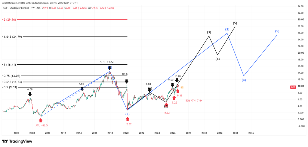
Online Trading – CGF WeeklyElliott Wave Structure and Fibonacci Extension
Having established the larger monthly Elliott Wave structure, we now examine how smaller price movements may develop within that broader pattern. The blue Elliott Wave count represents the monthly structure, while the black Elliott Wave count illustrates the proposed smaller weekly sequence. The Fibonacci extension is measured from the $2.82 low to the $7.83 high, then from the corrective low near $5.22. This produces a 100% extension around $16.41, close to the projected black Wave 3 region. The chart also shows a 161.8% extension near $24.79.These extension levels help us examine possible proportional relationships between Elliott Waves. However, the projected $16.41 Wave 3 region is not a guaranteed minimum, and the higher extension is not a confirmed price target. Both wave counts remain interpretations that must be reassessed as new price behaviour develops. Together, the monthly and weekly Elliott Wave charts demonstrate how a larger market structure can contain smaller advancing and corrective movements. This completes our technical analysis of Challenger Limited. We now turn to the company’s financial position and business fundamentals to examine information that price charts alone cannot provide.
Challenger Limited (ASX: CGF) – Fundamental Analysis and Company Financial Health
We have now completed the technical chart analysis of Challenger Limited. The next stage of this online trading masterclass examines the company behind the share price. This distinction matters because a chart can show how the market has behaved, but it cannot independently establish whether a business is financially strong, appropriately valued or exposed to significant future risks.
For this fundamental review, we are using company financial information and analysis presented through Simply Wall St, including Challenger’s FY2026 results and the estimates available in October 2026. Financial figures, valuations and analyst forecasts can change as new information becomes available. Our purpose is to understand what the reported information tells us and, equally importantly, what it does not.
Understanding Challenger Limited’s Business
Challenger Limited (ASX: CGF) is an Australian financial services company focused on retirement income and investment management. Its activities include annuity products and investment solutions designed to support the financial needs of individuals and institutions. This makes Challenger different from businesses that primarily earn revenue by manufacturing products or selling everyday consumer goods.
Annuities are particularly relevant to Challenger’s business model. They are financial products designed to provide income payments under specified terms. The company must manage the assets, liabilities and financial risks associated with its commitments. Interest rates, investment returns, credit quality and the duration of retirement-income obligations can therefore influence its financial performance.
For someone learning online trading, this is an important starting point. Before interpreting financial ratios, we need to understand how the company earns money and what obligations accompany that income. A financial services balance sheet cannot always be interpreted in the same way as the balance sheet of a conventional industrial business.
Challenger’s Market Value and Valuation
At the time of this October 2026 review, Challenger had a reported market capitalisation of approximately A$6.71 billion, with the share price around A$9.94 in the fundamental research snapshot. Market capitalisation represents the market value of the company’s ordinary shares, rather than the total value of its assets or the amount of cash it holds.
Simply Wall St reported a price-to-earnings ratio of approximately 14.3 times, compared with an Australian market reference of around 16.1 times. The P/E ratio compares the share price with earnings per share. It is one way of examining what investors are paying relative to the company’s reported earnings.
A lower P/E ratio does not automatically mean a company is undervalued. Differences in business quality, growth expectations, financial risk and the reliability of earnings can all influence valuation. Challenger’s valuation assessment also involves assumptions about future performance, and different analytical approaches can produce different conclusions.
This is why we do not describe CGF as a bargain simply because its P/E ratio is below a broad market comparison. Valuation is one part of the research process, and it must be considered alongside the company’s actual financial results and future expectations.
FY2026 Revenue, Earnings and Profitability
Challenger reported FY2026 revenue of approximately A$2.87 billion and net income of approximately A$469.1 million. The reported net income represented an increase of around 179% compared with FY2025. Earnings per share for the financial year were approximately A$0.68.
The improvement in reported earnings is significant, but it needs to be interpreted carefully. A strong percentage increase can partly reflect a lower comparative earnings base in the previous year. It does not establish that the same growth rate will continue in subsequent years.
Challenger’s reported net profit margin was approximately 16.35%. This indicates how much net profit was generated relative to reported revenue. However, the company’s earnings per share also missed analyst expectations by approximately 8.8%. These figures demonstrate why both the absolute result and the expectations surrounding that result matter.
A business can report substantially improved earnings and still fall short of what analysts expected. The market may already have anticipated some improvement before the results were announced. Therefore, strong financial results do not automatically translate into an immediate share-price increase.
Future Growth Expectations
The Simply Wall St research available in October 2026 showed forecast earnings growth of approximately 4.7% per year and forecast earnings-per-share growth of around 6.05% per year. These figures represent estimates, not financial results that Challenger has already achieved.
At the same time, the research presented a forecast decline in reported revenue of approximately 28.1% per year. This creates an important question for further investigation: how can forecast earnings improve while forecast revenue declines? The figures should not be assumed to move together.
Changes in margins, business composition, accounting treatment and other factors can influence the relationship between revenue and earnings. However, the forecasts alone do not establish which factors will explain Challenger’s future results. A disciplined researcher would investigate the underlying assumptions rather than inventing an explanation.
The research also indicated a forecast return on equity of approximately 12.56% over the relevant forecast horizon. Return on equity helps measure profitability relative to shareholders’ equity, but its interpretation depends on the company’s financial structure and the risks associated with generating those earnings.
Financial Health and Balance Sheet Structure
Challenger’s reported financial position included approximately A$36.8 billion in assets, A$32.73 billion in liabilities and A$4.06 billion in shareholders’ equity. The research also identified approximately A$8.43 billion in debt and a debt-to-equity ratio of around 207.4%.
These figures require particular care because Challenger operates in financial services. Its assets and liabilities are closely connected to investment activities and retirement-income obligations. A relatively high debt-to-equity ratio should not be interpreted in isolation as proof that the company is financially distressed.
Equally, the presence of substantial assets does not automatically establish financial safety. The quality, liquidity and risks associated with those assets matter, as do the timing and nature of the company’s obligations. Regulatory capital, credit exposure and the matching of assets against liabilities are especially important considerations for an annuity provider.
Simply Wall St also reported an interest coverage ratio of approximately 2.2 times. This is another measure that deserves investigation, but it cannot provide a complete financial health assessment on its own. Our educational objective is to recognise the questions raised by these figures, not to declare the company safe or unsafe from one ratio.
Challenger’s Dividends and Income Considerations
Challenger’s reported dividend yield was approximately 3.22% in the October 2026 research snapshot, with annual dividends of approximately A$0.31 per share. Dividend yield compares the annual dividend with the share price, so the percentage changes as the market price changes.
The company’s earnings payout ratio was reported at approximately 46%. This indicates the proportion of earnings represented by dividend payments under that calculation. It can help readers assess how dividends relate to profitability, although payout ratios are not guarantees of future payments.
Challenger’s final dividend of A$0.17 per share for FY2026 had an ex-dividend date of 25 August 2026 and a payment date of 17 September 2026. The research also identified an unstable historical dividend record. This is important because a current dividend yield does not establish that the same income will be maintained indefinitely.
For beginners, dividends should be examined alongside earnings, financial obligations, capital requirements and future business conditions. A share should not be assessed solely on the attractiveness of its current yield. Income is only one component of the broader investment picture.
Business Risks That Deserve Attention
Challenger’s retirement-income and investment activities expose the business to risks that are different from those of many ordinary ASX-listed companies. Understanding these risks is an essential part of responsible online trading research because favourable earnings or an improving share-price chart cannot remove them.
- Interest rate risk: Changes in interest rates can influence investment returns, product economics and the valuation of financial assets and obligations.
- Credit and investment risk: The performance and credit quality of assets supporting Challenger’s business can affect its financial results.
- Longevity and insurance-related risk: Retirement-income commitments require assumptions about how long payments may need to continue.
- Regulatory and capital risk: Financial services companies operate under regulatory requirements that can affect capital management and business operations.
- Growth and forecast risk: Future earnings estimates depend on assumptions that may not be achieved.
- Dividend risk: Future distributions depend on profitability, capital requirements and board decisions.
These risks do not establish that Challenger will experience a particular adverse event. They identify areas that deserve attention when evaluating the company. A complete assessment requires understanding both the opportunities associated with the business and the uncertainty surrounding future outcomes.
Bringing Challenger’s Technical and Fundamental Research Together
We have now examined Challenger Limited from two different perspectives. The technical analysis established the company’s historical price framework, weekly recovery structure, moving averages, trading volume and momentum. The fundamental analysis examined the business model, earnings, valuation, growth expectations, financial health, dividends and important risks.
These two forms of analysis answer different questions. Technical analysis helps describe how the market has behaved and where significant price reactions have occurred. Fundamental analysis helps us understand the company behind those movements and the financial information that may influence its longer-term prospects.
Challenger’s FY2026 earnings showed substantial improvement, while the forecasts and financial health figures highlight questions that require continued monitoring. On the weekly price chart, the recent $10.85 high and $9.38 corrective low remain useful structural references. Neither set of information provides certainty about the next price movement.
The central lesson of this online trading masterclass is that evidence should be gathered in a deliberate order. We begin with the broader market structure, examine the developing price behaviour, introduce supporting indicators and then investigate the underlying business. Risk remains part of the process throughout, rather than something considered only after a trading decision has been made.
Online Trading Masterclass – CGF Final Conclusion
Challenger Limited provides a practical example of how an ASX-listed financial services company can be examined through both technical and fundamental research. Its historical price movements demonstrate the importance of understanding timeframes, corrective phases and market structure before relying on technical indicators.
The financial research adds another layer by demonstrating that reported earnings growth, valuation, balance-sheet figures and dividends must be interpreted within the context of the business. A company can show improving earnings while still facing meaningful financial and operational risks. Likewise, a constructive chart does not guarantee a favourable investment outcome.
For beginners, the goal is not to predict Challenger’s next share-price movement. It is to develop the ability to ask better questions, recognise the limitations of each analytical tool and build confidence through a repeatable educational process. That is the foundation of the She Trades Shares approach to online trading: structure before strategy, risk before execution and education before action.
Want To Explore CGF Financials In More Detail?
View CGF On Simply Wall StOnline Trading – Resources
This Challenger Limited (ASX: CGF) masterclass forms part of the She Trades Shares Online Trading Masterclass series. Each company provides a different example of how market structure, technical indicators and fundamental research can be studied within a consistent educational framework.
Once you have completed this CGF masterclass, explore the other 4 masterclasses featuring ZIP (ASX), PLS (ASX) , QBE (ASX) and TLS (ASX). Each company provides a different example of how market structure develops across different sectors and market conditions. Comparing these charts will help you recognise how the same analytical principles can be applied to different shares. You can also explore additional educational tools, walkthroughs and learning resources inside the She Trades Shares Resource Hub.
Trading for Beginners Guide – The Ultimate Resource Hub
Masterclass Series
View Online Masterclass ZIP – Series 1 Here
View Online Masterclass PLS – Series 2 Here
View Online Masterclass QBE- Series 3 Here
View Online Masterclass TLS – Series 4 Here

2 Comments